What is the role of visual communication in shaping positive and inclusive interactive experiences?
OUTCOME SUMMARY
This outcome introduces interactive experience design through app analysis, a research-informed brief and the development and evaluation of ideas.
A great way to start is finding out what students already know. If the field is new, consider exploring everyday interactions first. This folio focuses on mobile apps, but websites, physical spaces and virtual reality offer other examples.
The Double Diamond provides a familiar process with different considerations: user journeys, navigation, feedback and changing screen states. App comparisons help reveal opportunities; briefs, wireframes and user flows help students explore responses. Encourage them to connect aesthetic style with function and evaluate ideas against user needs throughout.
Feel free to adapt the activities and suggested scope to your cohort. The aim is to build confidence in this field and connected folio habits for the upcoming SAT.
OUTLINE
1. Discover
Try comparing two similar apps with contrasting visual styles to uncover opportunities.
2. Define
Help students shape their findings into a brief and a matrix of design priorities.
3. Develop
Explore a brainstorm and two concepts, balancing function with aesthetic style.
4. Deliver (optional)
If time permits, explore a more polished screen sequence or interactive prototype.
5. Evaluate
Encourage reflection on the brief, user needs and possibilities for improvement.
1. DISCOVER
A great way to start is comparing two apps with a similar function: Find, Learn, Network or Plan. This gives students a starting point for their own related but distinctive app.
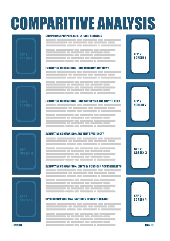
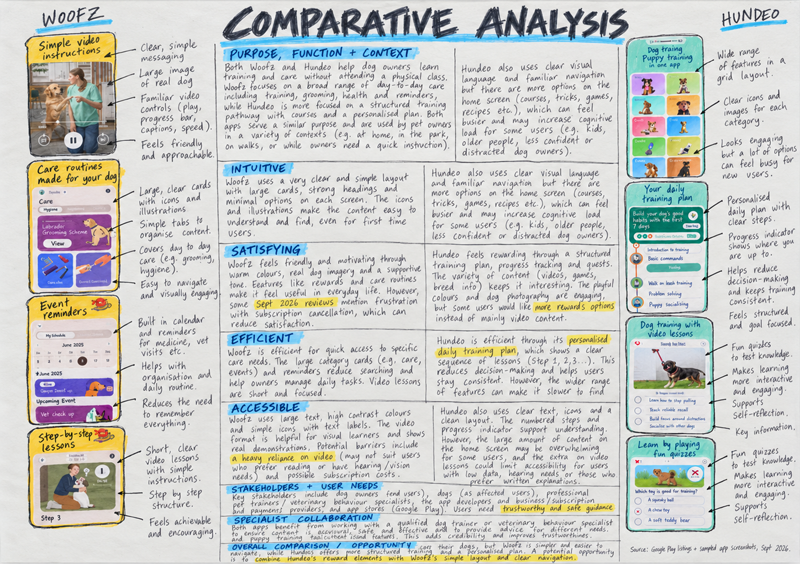
Consider modelling purpose, function, context, audience and intuitive, satisfying, efficient and accessible (ISEA) design. Matching screens can also open discussion about stakeholders and specialist collaboration.
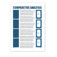
The supplied example from the resources tab below offers one layout: screenshots at the sides, comparisons in the centre and short annotations. Encourage students to note source links and access dates.
Around 500–700 words across the comparison is a starting point, with brief annotations. Feel free to adjust this to your cohort, keeping useful findings for Define.
CONNECTING TO THE STUDY DESIGN
Try connecting visual choices with user experience. How do imagery, type, colour and layout help a particular audience understand and enjoy the app?
A short interview, observation or existing research can help students explore stakeholders and access needs beyond their own assumptions.
It helps to distinguish visible evidence from promotional claims. Screenshots suggest how an app might work; they cannot establish actual usability or who designed it.
This is useful SAT folio practice: research reveals a need, then informs the brief, ideas and evaluation. Encourage students to highlight promising opportunities.
Teaching tips
Introduce the field. Consider sharing this interactive experience design guide from the resources tab below before comparing apps.
Try Google Play. Listings usually offer enough screenshots and details about purpose, audience and features for analysis.
No installation needed. Reassure students they need not download or sign up. Briefly discuss privacy and sharing personal information.
Look for contrasts. Similar apps with playful versus formal styling, or illustration versus photography, make useful comparisons.
Consider handwriting. Printed screens and handwritten notes can help students explain visual choices and identify opportunities for their own app.
Discover – interactive experience design
| Task items | 1-2 (Very low) | 3-4 (Low) | 5-6 (Medium) | 7-8 (High) | 9-10 (Very high) |
|---|---|---|---|---|---|
| App comparison | Two related apps are not identified or compared. | Apps are identified but their shared function is unclear. | Two apps with a similar function are compared using relevant examples. | Clear comparisons explain meaningful similarities and differences between the apps. | A well-supported comparison connects specific interface differences with each app’s shared function. |
| Purpose, function and context | Purpose, function and context are missing or confused. | Some details are identified but their meaning remains unclear. | Each app’s purpose, function and context are generally clear. | Specific examples explain how purpose, function and context connect. | Detailed comparisons clearly explain how each app responds to its purpose and context. |
| ISEA analysis | ISEA is missing or used inaccurately. | ISEA judgements are broad or unsupported for either app. | All four ISEA qualities are considered with relevant examples. | Clear ISEA analysis uses specific interface features from both apps. | Balanced ISEA analysis explains strengths and barriers through precise comparisons and visual evidence. |
| Specialist collaboration | No relevant specialist or contribution is identified. | A specialist is named but their contribution is vague. | A relevant specialist’s possible contribution is explained clearly. | A plausible example connects specialist collaboration with a design decision. | Clear reasoning explains how collaboration could improve the experience, distinguishing evidence from assumptions. |
| Stakeholder needs | Stakeholders and their needs are missing or unclear. | Stakeholders are named with little explanation of their needs. | Relevant stakeholder needs are linked to each app’s design. | Research or interface evidence explains how different needs are addressed. | Thoughtful comparisons explain supported needs, remaining barriers and opportunities using clear evidence. |
Key knowledge covered (Unit 2, Outcome 3 – Task 1)
| ✓ / ✗ | Key knowledge |
|---|---|
| ✓ | the collaborative practices of designers working in the fields of user-experience and interaction design |
| ✓ | aesthetic considerations and conceptions of good design relevant to the design of interactive experiences |
| ✓ | the diverse needs of users when interacting with devices, systems and services |
| ✗ | the role of the brief in guiding the development of design solutions |
| ✓ | applications of the VCD design process relevant to user-experience and interaction design projects |
| ✓ | human-centred research methods used to identify interaction design problems and understand stakeholders |
| ✗ | methods, media and materials used to visualise, test and present interaction design solutions |
| ✓ | appropriate design terminology |
Key skills covered (Unit 2, Outcome 3 – Task 1)
| ✓ / ✗ | Key skills |
|---|---|
| ✓ | identify and research interaction design problems or opportunities |
| ✗ | document an interaction design need in the form of a brief |
| ✓ | apply the stages of the VCD design process to resolve an interaction design problem |
| ✗ | select and use manual and digital methods, media, materials and design elements and principles appropriate for the design of inclusive interactive experiences suitable for diverse user needs |
| ✗ | present design concepts for critique, and both deliver and respond to feedback |
| ✗ | annotate design ideas and concepts using appropriate design terminology to explain and evaluate design decisions |
| ✗ | test and evaluate the usability and suitability of design concepts |
| ✗ | select suitable static formats for the presentation of a digital interface solution |
2. DEFINE
A useful starting point is revisiting opportunities from the comparison. Help students shape one into a brief for a similar app with a distinctive audience, purpose or context.
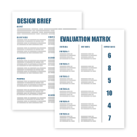
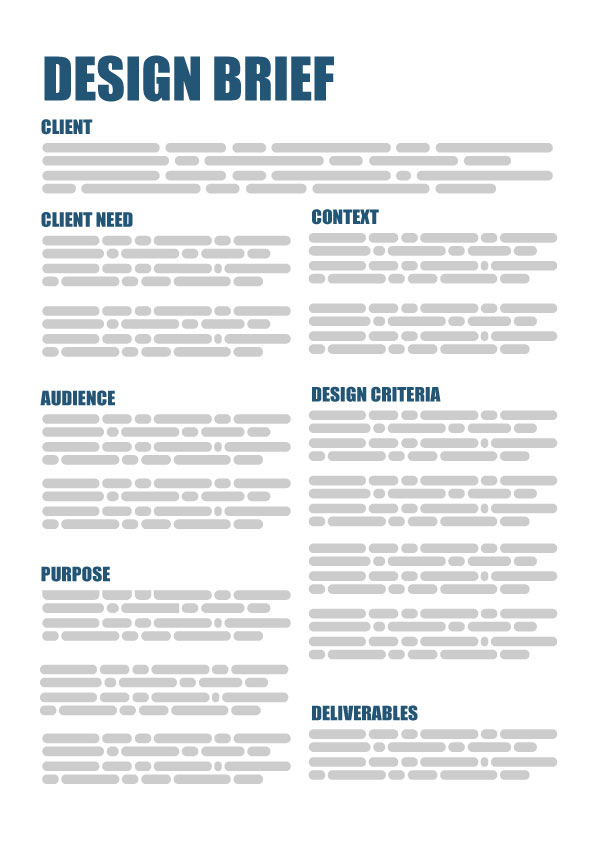
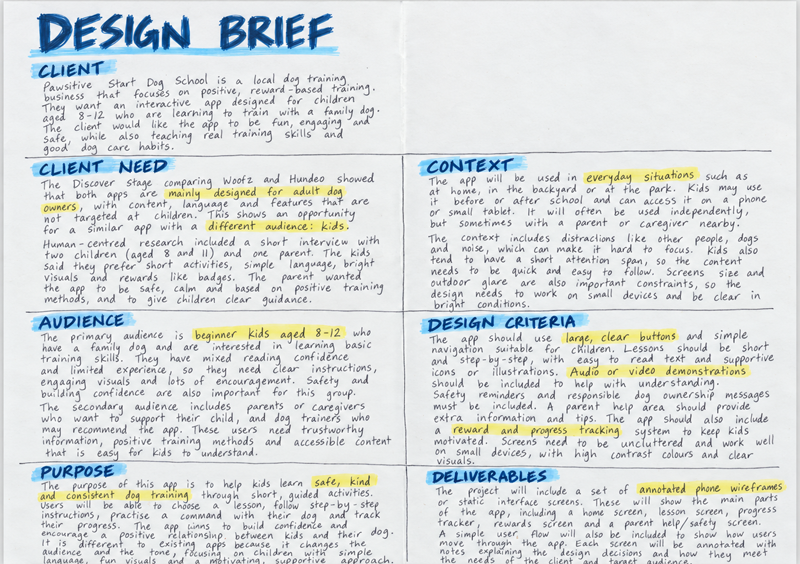
The brief example from the resources tab below uses Client, Client need, Audience, Purpose, Context, Design criteria and Deliverables. Around 400–600 words on a page or spread is a flexible guide; adapt it to your cohort.
Consider discussing how the student example from the resources tab below moves from adult-focused dog-training apps to children aged 8–12. Students can follow that research-to-opportunity connection without copying the topic or inventing interviews.
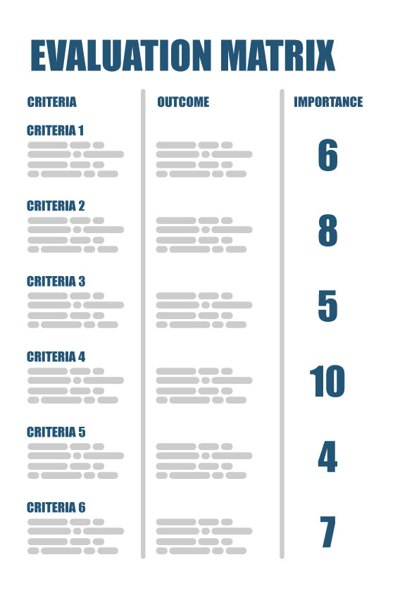
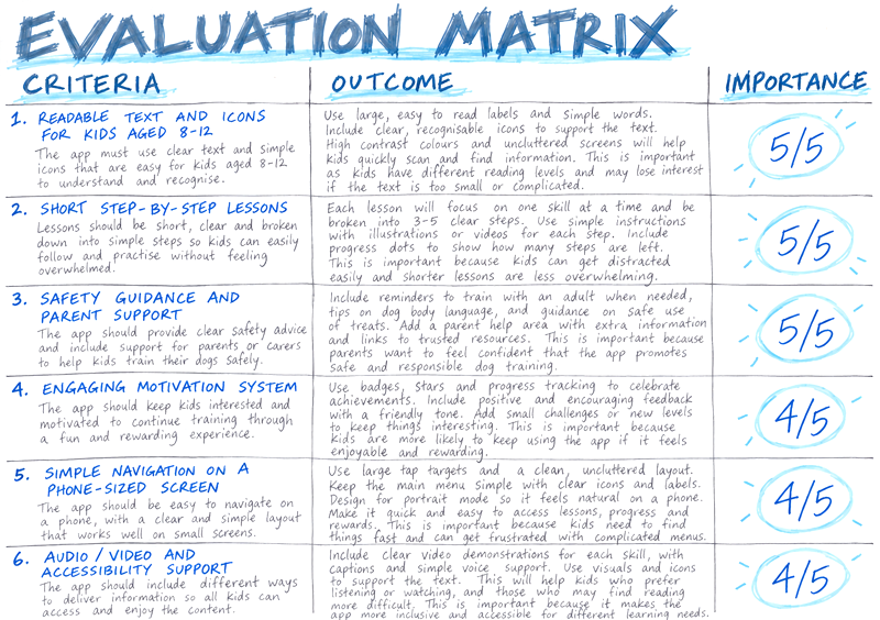
A separate matrix can capture around six priorities. The matrix example from the resources tab below uses Criteria, Outcome and Importance columns to link each need with an intended response and a reason for its rating.
CONNECTING TO THE STUDY DESIGN
Think of the brief as a bridge between Discover and Develop. A quick conversation about the evidence behind each requirement can help before drawing begins.
Students often introduce new ideas here without explaining them. Encourage them to record new findings and update the brief when their direction changes.
This connection between stages is valuable preparation for the SAT folio. The examples from the resources tab below offer starting points for discussing research, criteria, development and reflection.
Try including aesthetic and functional priorities in the matrix. Readable labels and a friendly visual tone, for example, can both support a younger audience.
Teaching tips
When the brief is too broad. “An app for everyone” can leave students stuck. Narrowing the audience, main task and setting often gives them a clearer direction.
Leave room to explore. Try not to settle every colour, typeface or button position in the brief. Describing the intended experience leaves more possibilities open.
Keep ratings simple. A labelled 1–5 scale, with 5 essential, works well. The examples from the resources tab below use different scales; consistency and reasons matter more than the numbers chosen.
Keep the scope manageable. Annotated screens and a user flow may be enough, with polish if time permits. A quick check back to research helps keep the folio connected. Students often find it easier to explain these links aloud before committing them to a written brief.
Define – interactive experience design
| Task items | 1-2 (Very low) | 3-4 (Low) | 5-6 (Medium) | 7-8 (High) | 9-10 (Very high) |
|---|---|---|---|---|---|
| Design opportunity | The opportunity is missing or does not identify a need. | An app idea is given with little difference from existing examples. | A clear opportunity changes the purpose, context or audience. | Research explains a meaningful difference from the apps compared in Discover. | A focused opportunity explicitly builds on the comparative analysis and user research to justify a distinct purpose, context or audience. |
| Audience and research | Audience is absent or too vague to guide design. | Audience is identified with few relevant needs or characteristics. | Audience characteristics and needs are supported by some research. | Specific research findings explain the audience and its important needs. | Clear, relevant user evidence shapes the proposed interface and avoids unsupported assumptions. |
| Brief and purpose | Client, communication need or purpose are missing. | Parts of the brief are unclear or disconnected. | The brief states the client, communication need and purpose. | A clear brief connects the proposed app with its users’ goals. | A concise, coherent brief uses research to guide an appropriate range of possible responses. |
| Context and constraints | Context, device or practical constraints are missing. | Context and constraints are vague or incomplete. | Context, device and relevant constraints are described clearly. | The brief explains how context and constraints affect the intended task. | Specific conditions and realistic constraints provide a clear direction for inclusive interface development. |
| User-needs matrix | The user-needs matrix or importance ratings are missing. | Needs or ratings are too general to guide decisions. | A matrix lists relevant needs and understandable importance ratings. | Consistent ratings are justified and connected to design criteria. | Research-based priorities clearly guide concept comparison and provide useful criteria for final evaluation. |
Key knowledge covered (Unit 2, Outcome 3 – Task 2)
| ✓ / ✗ | Key knowledge |
|---|---|
| ✗ | the collaborative practices of designers working in the fields of user-experience and interaction design |
| ✓ | aesthetic considerations and conceptions of good design relevant to the design of interactive experiences |
| ✓ | the diverse needs of users when interacting with devices, systems and services |
| ✓ | the role of the brief in guiding the development of design solutions |
| ✓ | applications of the VCD design process relevant to user-experience and interaction design projects |
| ✓ | human-centred research methods used to identify interaction design problems and understand stakeholders |
| ✗ | methods, media and materials used to visualise, test and present interaction design solutions |
| ✓ | appropriate design terminology |
Key skills covered (Unit 2, Outcome 3 – Task 2)
| ✓ / ✗ | Key skills |
|---|---|
| ✓ | identify and research interaction design problems or opportunities |
| ✓ | document an interaction design need in the form of a brief |
| ✓ | apply the stages of the VCD design process to resolve an interaction design problem |
| ✗ | select and use manual and digital methods, media, materials and design elements and principles appropriate for the design of inclusive interactive experiences suitable for diverse user needs |
| ✗ | present design concepts for critique, and both deliver and respond to feedback |
| ✗ | annotate design ideas and concepts using appropriate design terminology to explain and evaluate design decisions |
| ✗ | test and evaluate the usability and suitability of design concepts |
| ✗ | select suitable static formats for the presentation of a digital interface solution |
3. DEVELOP
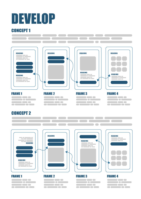
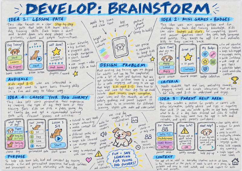
Consider starting with a broad brainstorm before exploring two concepts. This gives students room to try different interactions and aesthetic styles in response to their brief.
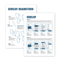
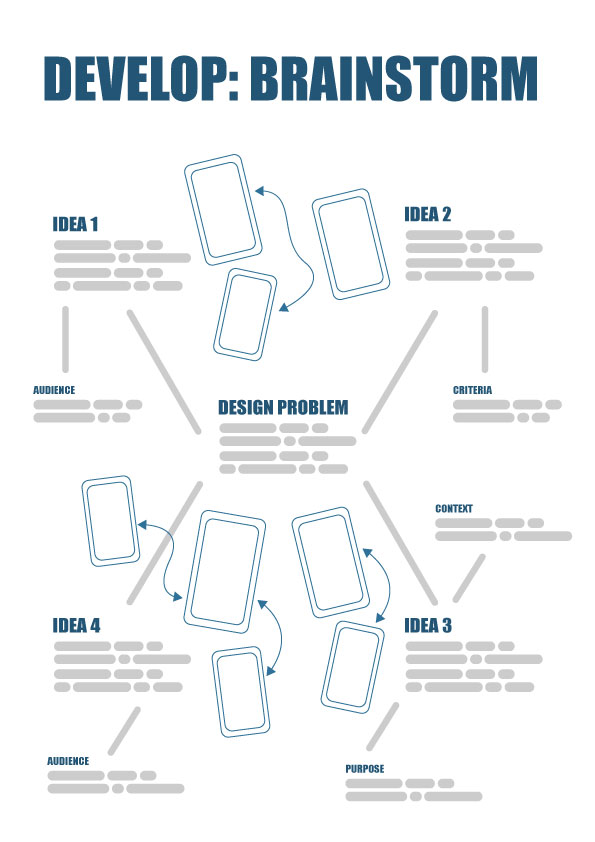
The brainstorm example from the resources tab below places the problem centrally, branching into audience, purpose, context and ideas. Quick phone sketches, imagery tests and colour notes can work well.
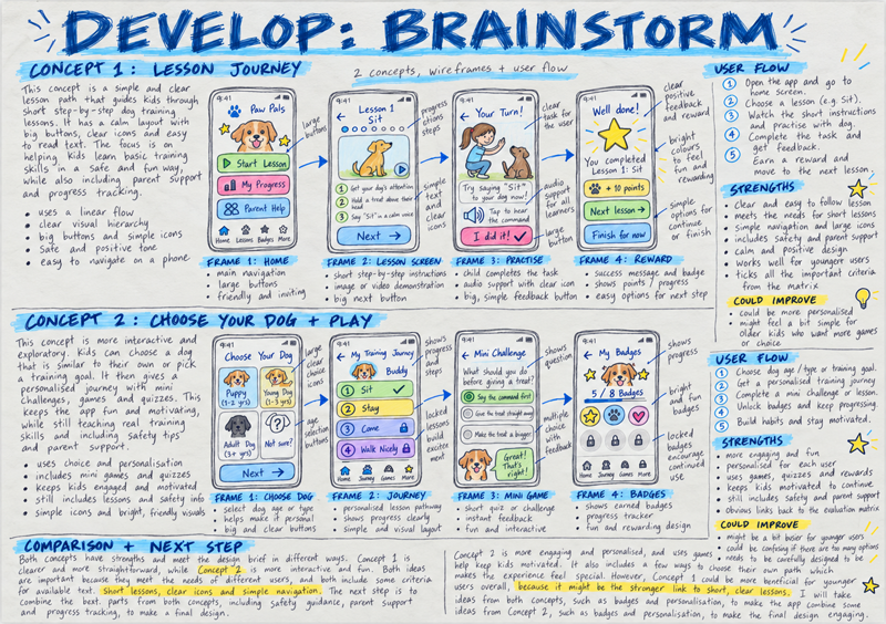
Around four screens per concept, linked with arrows or a numbered flow, is a useful starting point. Adjust the number to suit the task and cohort.
A short peer walkthrough can help students compare strengths and weaknesses against their matrix, then explain which direction they would like to develop.
CONNECTING TO THE STUDY DESIGN
Consider briefly distinguishing wireframes, which show screen structure, from user flows, which map actions and responses. Both help students explore the brief.
Try exploring imagery, type, colour, icons and spacing alongside function. Small swatches and loose sketches can suggest a style without polished artwork.
Students sometimes focus only on function, or simply making an app look different. Asking how style supports audience, clarity or enjoyment can reconnect the two.
This is useful SAT preparation: recording alternatives, feedback and reasons makes development visible, even when the drawings remain rough.
Teaching tips
Keep early sketches quick. Short drawing intervals can help students avoid spending the ideas stage perfecting high-fidelity wireframes or individual icons.
Use examples flexibly. The examples from the resources tab below use coloured sketches to communicate intent; students need not match the finish. Rough placeholders and a few style samples are useful too.
Explore meaningful differences. A palette change needs a purpose. A new function may call for more research and a revised brief.
Keep notes useful. Encourage students to explain a choice and its benefit. A peer following the screens can reveal gaps worth annotating.
Develop – interactive experience design
| Task items | 1-2 (Very low) | 3-4 (Low) | 5-6 (Medium) | 7-8 (High) | 9-10 (Very high) |
|---|---|---|---|---|---|
| Brainstorm | The brainstorm is absent or unrelated. | Ideas repeat one approach with little exploration. | A brainstorm includes ideas and quick design sketches. | Varied branches explore functions, visual ideas and ways to navigate. | A brainstorm explores distinct possibilities and connects them with priority user needs. |
| Two wireframe concepts | Two wireframe concepts are missing or cannot be followed. | Concepts are incomplete or differ only in surface appearance. | Two concepts show screen content and controls. | Both concepts explore content, navigation and an aesthetic style suited to the audience. | Two developed alternatives connect aesthetic choices with function and explain distinct responses to the brief and users. |
| User flows | User flows are missing or disconnected from the concepts. | Flows show some actions but leave important steps unclear. | Each concept has a flow showing the main task sequence. | Clear flows connect screens, decisions and useful feedback for both concepts. | Complete, readable flows explain actions, choices and outcomes while exposing possible barriers for users. |
| Design terminology | Annotations are absent or unrelated to design decisions. | Annotations name features with little explanation of their purpose. | Annotations explain choices using appropriate design terminology. | Accurate terms connect visual choices with the intended experience. | Explanations evaluate design choices against the brief, user needs and the evaluation matrix. |
| Comparison and refinement | No useful comparison or review of concepts is shown. | Concepts are compared mainly through personal preferences. | A comparison identifies strengths and possible improvements. | The brief, matrix and feedback guide explained refinements. | Evidence-based comparison leads to improvements and a justified choice of concept for evaluation. |
Key knowledge covered (Unit 2, Outcome 3 – Task 3)
| ✓ / ✗ | Key knowledge |
|---|---|
| ✗ | the collaborative practices of designers working in the fields of user-experience and interaction design |
| ✓ | aesthetic considerations and conceptions of good design relevant to the design of interactive experiences |
| ✓ | the diverse needs of users when interacting with devices, systems and services |
| ✓ | the role of the brief in guiding the development of design solutions |
| ✓ | applications of the VCD design process relevant to user-experience and interaction design projects |
| ✗ | human-centred research methods used to identify interaction design problems and understand stakeholders |
| ✓ | methods, media and materials used to visualise, test and present interaction design solutions |
| ✓ | appropriate design terminology |
Key skills covered (Unit 2, Outcome 3 – Task 3)
| ✓ / ✗ | Key skills |
|---|---|
| ✗ | identify and research interaction design problems or opportunities |
| ✗ | document an interaction design need in the form of a brief |
| ✓ | apply the stages of the VCD design process to resolve an interaction design problem |
| ✓ | select and use manual and digital methods, media, materials and design elements and principles appropriate for the design of inclusive interactive experiences suitable for diverse user needs |
| ✓ | present design concepts for critique, and both deliver and respond to feedback |
| ✓ | annotate design ideas and concepts using appropriate design terminology to explain and evaluate design decisions |
| ✓ | test and evaluate the usability and suitability of design concepts |
| ✗ | select suitable static formats for the presentation of a digital interface solution |
4. DELIVER (OPTIONAL)
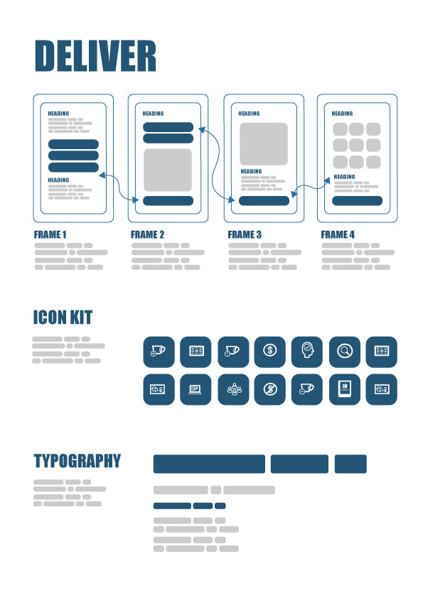
If time permits, this extension gives students a chance to refine a selected concept into polished static screens or an interactive prototype. Adapt the scope to your cohort.
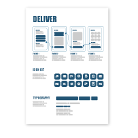
The Deliver layout from the resources tab below suggests a screen sequence, captions, icons and typography samples. Feel free to simplify it while keeping the visual style consistent.
Drawing or presentation software already available at school is fine. Linking screens is another option; students do not need to code a working app or sign up.
Agreeing a manageable scope early can help. Encourage students to build on their brief, selected concept and feedback, noting any changes along the way.
CONNECTING TO THE STUDY DESIGN
Consider comparing how static screens explain interactions and how a prototype supports a walkthrough. Either can help communicate an interface proposal.
Repeated controls, icons, type and colour can support recognition and identity. This is a good opportunity to discuss how visual consistency helps users.
Try not to spend too much time on decorative device mock-ups. Readable content and a clear sequence usually communicate the experience more effectively.
If you skip this extension, developed static concepts can communicate the proposal. Students can still evaluate those ideas against their brief and matrix.
Teaching tips
Keep high fidelity optional. Polished prototypes can take considerable time, especially when software is unfamiliar. If Adobe XD is available, exploring it may be an enjoyable extension, but static screens also suit this folio activity.
Try a separate Spotify reskin. The tutorial from the resources tab below offers an alternative activity: creating a new visual skin for Spotify. It can introduce aesthetics and prototyping without connecting to the folio, particularly for students considering this field for their SAT next year.
Deliver (optional extension) – use only if this task is completed
| Task items | 1-2 (Very low) | 3-4 (Low) | 5-6 (Medium) | 7-8 (High) | 9-10 (Very high) |
|---|---|---|---|---|---|
| High-fidelity wireframe | The optional submission does not communicate a clear screen sequence. | Screens show a partial sequence with limited visual development. | Developed screens communicate the chosen concept and main user task. | A consistent screen sequence develops the chosen concept. | A refined sequence uses realistic detail to communicate the intended experience with strong visual clarity. |
| Visual consistency | Visual elements are unrelated or difficult to recognise. | Some repeated elements vary without a clear purpose. | Symbols, type and colour work consistently across screens. | Coherent visual choices support readability and recognition throughout the sequence. | A coordinated visual system supports accessible use and a clear, appropriate aesthetic direction. |
| Intended interactions | Users cannot identify the intended actions or next step. | Some actions or navigation cues remain unclear. | The presentation communicates the main actions and screen sequence. | Navigation, actions and feedback are clear throughout the chosen format. | Cues or working prototype links communicate the complete intended journey and its responses. |
| Presentation format | The presentation format obscures the design or intended sequence. | Some screens or labels are difficult to follow. | An interactive or printed format communicates the design clearly. | A well-organised presentation makes the screens and user journey clear. | A polished, appropriate presentation connects the app’s purpose, visual direction and intended interactions. |
| Brief alignment | The presented concept does not address the brief. | Some needs are addressed but major gaps remain. | The presentation responds to the brief and user needs. | Clear choices address the audience, context and priority needs. | A considered presentation demonstrates how the design fulfils its brief and important user priorities. |
Key knowledge covered (Unit 2, Outcome 3 – Task 4 – optional extension)
| ✓ / ✗ | Key knowledge |
|---|---|
| ✗ | the collaborative practices of designers working in the fields of user-experience and interaction design |
| ✓ | aesthetic considerations and conceptions of good design relevant to the design of interactive experiences |
| ✓ | the diverse needs of users when interacting with devices, systems and services |
| ✓ | the role of the brief in guiding the development of design solutions |
| ✓ | applications of the VCD design process relevant to user-experience and interaction design projects |
| ✗ | human-centred research methods used to identify interaction design problems and understand stakeholders |
| ✓ | methods, media and materials used to visualise, test and present interaction design solutions |
| ✓ | appropriate design terminology |
Key skills covered (Unit 2, Outcome 3 – Task 4 – optional extension)
| ✓ / ✗ | Key skills |
|---|---|
| ✗ | identify and research interaction design problems or opportunities |
| ✗ | document an interaction design need in the form of a brief |
| ✓ | apply the stages of the VCD design process to resolve an interaction design problem |
| ✓ | select and use manual and digital methods, media, materials and design elements and principles appropriate for the design of inclusive interactive experiences suitable for diverse user needs |
| ✗ | present design concepts for critique, and both deliver and respond to feedback |
| ✓ | annotate design ideas and concepts using appropriate design terminology to explain and evaluate design decisions |
| ✗ | test and evaluate the usability and suitability of design concepts |
| ✓ | select suitable static formats for the presentation of a digital interface solution |
5. EVALUATE
A helpful finish is reflecting on the chosen concept against the brief and matrix. This works with developed sketches as well as an optional polished solution.
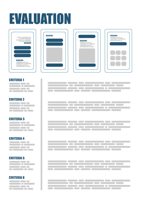
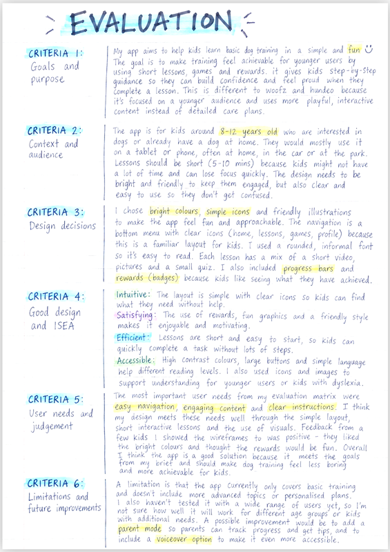
The student example from the resources tab below offers six headings: Goals and purpose; Context and audience; Design decisions; Good design and ISEA; User needs and judgement; Limitations and future improvements.
Around 400–600 words is a flexible starting point. Consider pairing short paragraphs with criteria and key screens on a folio page or spread, adapting to your cohort.
Encourage students to draw on screens, research and feedback when explaining what works, what remains uncertain and what they might improve.
CONNECTING TO THE STUDY DESIGN
A return to the Discover findings and brief can help students evaluate the original opportunity and explain any changes in direction.
Try discussing aesthetic style and function together: how do imagery, type, colour and navigation support the audience’s understanding, confidence and enjoyment?
ISEA offers useful prompts: intuitive, satisfying, efficient and accessible. Remind students that promising visual ideas still need testing before making confident usability claims.
This reflection builds SAT folio habits. References to earlier pages or criteria help connect research, development, feedback and evaluation into a coherent story.
Teaching tips
Help claims become specific. Students often write “easy to use”. Naming a visual choice and explaining its benefit gives that judgement more substance.
Revisit priorities. The highest-rated matrix needs are a useful starting point. Encourage discussion of trade-offs and any requirements that remain unresolved.
Discuss the example. The student example from the resources tab below uses six headings to organise reflection, rather than add rubric criteria. Consider where its claims might benefit from further testing.
Leave room for improvement. An honest limitation and achievable next step can show thoughtful evaluation. There is no need to pretend every problem is solved.
Evaluate – interactive experience design
| Task items | 1-2 (Very low) | 3-4 (Low) | 5-6 (Medium) | 7-8 (High) | 9-10 (Very high) |
|---|---|---|---|---|---|
| Goals and purpose | Design goals or purpose are missing. | Goals are mentioned but remain broad or unclear. | The rationale states the main goals and purpose. | Goals and purpose connect with the original opportunity. | The opening connects the opportunity, goals and intended user benefit. |
| Context and audience | Audience and context are absent or incorrectly described. | Audience or context is mentioned with little design relevance. | The rationale identifies users and conditions of use. | Choices are explained through audience needs and context. | Evidence explains responses to users’ needs and conditions of use. |
| Design decisions | Design choices are listed without explaining their purpose. | Broad claims have few supporting examples from the design. | Examples explain how design choices support the goals. | Visual and interaction choices address stated goals. | Well-chosen examples explain how connected decisions address the brief and experience. |
| Good design and ISEA | ISEA and aesthetic choices are not meaningfully considered. | Comments about good design are general or unsupported. | ISEA and aesthetic choices are discussed using examples. | Clear explanations connect visual choices with useful and inclusive interaction. | Balanced ISEA evaluation explains strengths and limitations using design examples and feedback. |
| User needs and judgement | User needs and a final judgement are missing. | The judgement mentions needs without using the matrix. | Important matrix priorities inform a final judgement. | A balanced judgement explains met needs, limitations and an improvement. | A supported conclusion weighs priorities and trade-offs, justifying a realistic improvement. |
Key knowledge covered (Unit 2, Outcome 3 – Task 5)
| ✓ / ✗ | Key knowledge |
|---|---|
| ✗ | the collaborative practices of designers working in the fields of user-experience and interaction design |
| ✓ | aesthetic considerations and conceptions of good design relevant to the design of interactive experiences |
| ✓ | the diverse needs of users when interacting with devices, systems and services |
| ✓ | the role of the brief in guiding the development of design solutions |
| ✓ | applications of the VCD design process relevant to user-experience and interaction design projects |
| ✗ | human-centred research methods used to identify interaction design problems and understand stakeholders |
| ✗ | methods, media and materials used to visualise, test and present interaction design solutions |
| ✓ | appropriate design terminology |
Key skills covered (Unit 2, Outcome 3 – Task 5)
| ✓ / ✗ | Key skills |
|---|---|
| ✗ | identify and research interaction design problems or opportunities |
| ✗ | document an interaction design need in the form of a brief |
| ✓ | apply the stages of the VCD design process to resolve an interaction design problem |
| ✗ | select and use manual and digital methods, media, materials and design elements and principles appropriate for the design of inclusive interactive experiences suitable for diverse user needs |
| ✗ | present design concepts for critique, and both deliver and respond to feedback |
| ✓ | annotate design ideas and concepts using appropriate design terminology to explain and evaluate design decisions |
| ✓ | test and evaluate the usability and suitability of design concepts |
| ✗ | select suitable static formats for the presentation of a digital interface solution |