

This is a demo of the Classic page, currently in development for launch in 2027. You have full access to Design Fundamentals and partial access to all other content.
 Point
Point Line
Line Shape
Shape Form
Form Tone
Tone Colour
 Texture
 Type
Type
THE EIGHT DESIGN ELEMENTS
THE EIGHT DESIGN ELEMENTS
INTRODUCTION
THE EIGHT DESIGN ELEMENTS
Design elements are the visual building blocks of a design. Explore the eight elements, then look closer at how different representations of each can change the appearance and meaning of a design.
TERM
Point
Point is a small mark or position in a design. Individual points can attract attention, while groups of points can create patterns, outlines, texture and images. Their spacing and size can suggest different moods.

TRY THIS!
Create two small symbols using dots only: one that feels calm and one that feels energetic. Change the size, spacing and density of your dots, then explain which choice made the biggest difference.

TERM
Line
Line is a continuous path between points. Its direction, thickness and character can define shapes, suggest movement and guide the viewer's eye. Line weight can emphasise important details over others.
TRY THIS!
Draw an animal logo using one continuous line without lifting your pen. Repeat it with a different line weight or more angular turns. Which version best communicates the animal's character?

TERM
Shape
Shape is a two-dimensional area defined by an outline or a change in colour or tone. Shapes can be simple or complex and help organise a composition or communicate an idea. Their edges and proportions can suggest different moods and associations.
TRY THIS!
Design a recognisable animal using only circles, triangles and rectangles. Make a second version using organic shapes. Compare how the shapes change its personality and use one gap as a deliberate negative shape.

TERM
Form
Form refers to the three-dimensional qualities of an object, including its height, width and depth. Designers can create physical forms or suggest depth through drawing, lighting and digital modelling. Viewing angles help reveal how a form occupies space.
TRY THIS!
Turn a flat letter from your name into a three-dimensional form. Add depth and shade it from one light source. Sketch it again from another angle to show how its appearance changes.

TERM
Tone
Tone describes how light or dark something appears. Differences in tone can create contrast, show light and shadow, suggest three-dimensional form and influence the mood of a design. Careful tonal choices also help important details stand out clearly.
TRY THIS!
Draw the same simple object twice using five tones from white to black. Give one drawing strong contrast and the other gentle contrast. Compare the mood and how clearly the form is shown.

TERM
Texture
Texture describes how a surface looks or feels, from smooth and polished to rough and uneven. It may be physical and touchable or visually suggested through images and marks. These surface qualities help communicate a material or intended experience.
TRY THIS!
Draw three squares to suggest rough stone, smooth metal and soft fabric using pencil marks only. Ask a partner to identify each surface, then refine the marks that were least convincing.

TERM
Type
Type is the visual form of letters, numbers and other characters in a design. Typeface choice, weight, size and arrangement influence readability, emphasis and the overall aesthetic. Letter spacing also affects how comfortably we read.
TRY THIS!
Write the same word in three styles to suggest calm, excitement and authority. Change the letter shapes, weight and spacing without adding pictures. Ask a partner which mood each version communicates.

TERM
Colour
Colour is a design element that can organise information, draw attention and establish a visual identity. Designers select and combine colours by considering hue, saturation, value and the relationships between colours. These choices can suggest moods, although meanings vary with context.
TRY THIS!
Create two three-colour palettes for the same cafe: one lively and one relaxed. Apply each to a simple sign, keeping the layout identical. Explain how hue and saturation change the atmosphere.

VIDEO
THE EIGHT DESIGN ELEMENTS

Worked Example
Identify two design elements and describe how each has been used effectively in the design example. (6 Marks)
Contention Begin with a clear statement that identifies both design elements and explains what their use helps the design achieve.
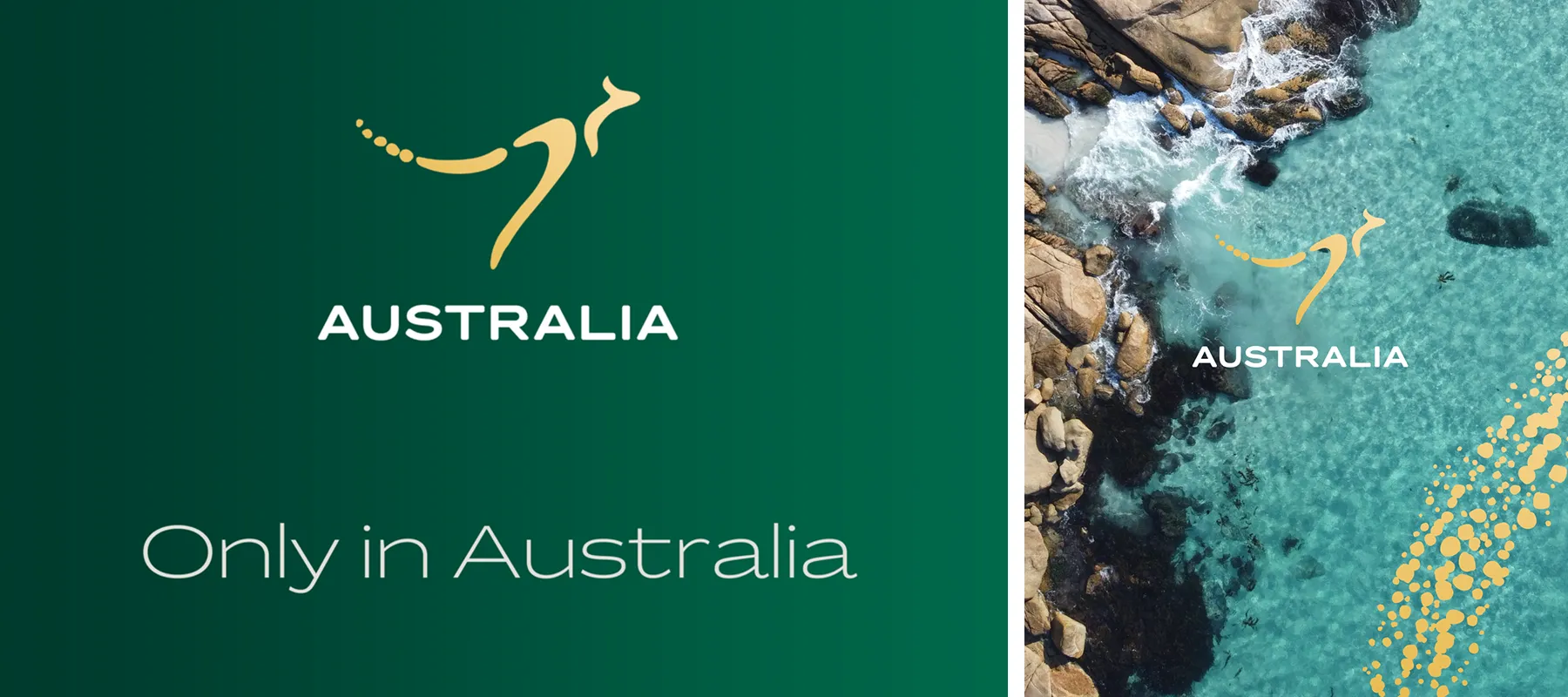
The Australia identity uses the design elements of colour and shape effectively to create a distinctive visual identity that connects the design with Australia and its natural environment.
Evidence Refer directly to visible features in the design example that support your contention.
Colour is used through the deep green background and warm gold kangaroo symbol, while the photographic application places the same gold symbol over turquoise ocean water. Shape is evident in the simplified kangaroo symbol, which is constructed from curved organic shapes and a trail of small circular shapes.
Description Describe the elements using precise design language, then explain why each choice is effective.
The deep green and warm gold create a bold and recognisable colour palette, while the turquoise ocean introduces a cooler colour that connects the identity with the Australian coastal environment. Repeating the gold symbol across both applications helps maintain a consistent visual identity. The kangaroo has been reduced to flowing, rounded shapes rather than a detailed illustration. Its long curved body, raised tail and smaller circular shapes create a simple silhouette that remains recognisable at different sizes and against different backgrounds.
Conclusion Finish by reconnecting both elements to the effectiveness of the overall design.
Together, colour and shape make the identity distinctive, recognisable and visually consistent. The simplified kangaroo and coordinated green, gold and turquoise palette communicate a clear Australian character while allowing the identity to work across different applications.
Start by naming both design elements and making a clear claim about how they are effective. In this answer: The Australia identity uses the design elements of colour and shape effectively to create a distinctive visual identity that connects the design with Australia and its natural environment.
Point to specific visible features from the example. Avoid vague comments or assumptions. In this answer: Colour is used through the deep green background and warm gold kangaroo symbol, while the photographic application places the same gold symbol over turquoise ocean water. Shape is evident in the simplified kangaroo symbol, which is constructed from curved organic shapes and a trail of small circular forms.
Describe exactly HOW each element has been used, then explain WHY that choice is effective. Use precise words such as deep, warm, cool, curved, organic, simplified and rounded. In this answer: The deep green and warm gold create a bold and recognisable colour palette, while the turquoise ocean introduces a cooler colour that connects the identity with the Australian coastal environment. Repeating the gold symbol across both applications helps maintain a consistent visual identity. The kangaroo has been reduced to flowing, rounded shapes rather than a detailed illustration. Its long curved body, raised tail and smaller circular shapes create a simple silhouette that remains recognisable at different sizes and against different backgrounds.
Finish by reconnecting the evidence to why the use of the elements is effective. In this answer: Together, colour and shape make the identity distinctive, recognisable and visually consistent. The simplified kangaroo and coordinated green, gold and turquoise palette communicate a clear Australian character while allowing the identity to work across different applications.
 Balance
 Figure/Ground
 Hierarchy
 Pattern
 Contrast
 Scale
Scale Proportion
 Cropping
THE EIGHT DESIGN PRINCIPLES
THE EIGHT DESIGN PRINCIPLES
INTRODUCTION
THE EIGHT DESIGN PRINCIPLES
Design principles describe how visual elements are arranged within a composition and how they work together. Explore the eight principles, then look closer at how different uses of each can influence emphasis, meaning and aesthetic qualities.
TERM
Balance
Balance is the distribution of visual weight across a composition. Designers can achieve balance through mirrored arrangements or through different elements that feel visually equal in weight.

PRO TIP
When discussing asymmetrical balance, explain how the visual weight on one side is balanced by the other. Has the designer used colour, form, shape, detail or scale to balance out one item from another?

TERM
Figure/Ground
Figure/ground describes the relationship between a subject (the figure) and the surrounding space (the ground). Designers can change which part of a composition attracts attention by altering the relative size, contrast and placement of figure and ground.
TRY THIS!
Create a small design using only black and white paper. Cut shapes so both the solid areas and the spaces between them help form the image. Ask a classmate what they notice first.

TERM
Hierarchy
Hierarchy is the order in which a viewer notices and reads information in a design. Designers can establish hierarchy using placement, colour, scale and figure/ground relationships to make some elements more prominent than others.
TRY THIS!
Look through one of your school's textbooks and identify the intended reading order. Has the designer used scale, coloured boxes, different fonts, illustrations or photographs? Annotate one page to explain what you notice first, second and third.

TERM
Pattern
Pattern is an organised arrangement of design elements using repetition or alternation. Repeated elements create consistency and rhythm, while alternating elements introduce a regular change in colour, shape, size or another visual quality.
PRO TIP
Patterns can repeat one element or alternate two or more elements in a sequence. Repetition might be A-A-A-A; alternation might be A-B-A-B. Identify the repeating unit and explain how it creates rhythm.

TERM
Contrast
Contrast is the difference between visual qualities within a composition. Designers use differences in texture, tone, colour and scale to create emphasis, distinguish information and influence the aesthetic of a design.
TRY THIS!
Create two versions of a simple poster heading. Use contrast in colour in one and contrast in scale in the other. Ask a partner which is noticed first and why.

TERM
Scale
Scale describes the size of an element relative to other elements, its surroundings or an expected size. Designers can vary scale to suggest depth, create emphasis and organise a composition.
PRO TIP
Explain what an element is large or small compared with. Then connect that size relationship to its effect: emphasis, depth or an unexpected sense of importance.

TERM
Proportion
Proportion refers to the size relationships between parts of an object or between elements in a design. Designers can maintain familiar proportions for a realistic appearance or deliberately distort them to create a different visual effect.
TRY THIS!
Draw the same object three times, changing its height compared with its width. Compare how the proportions affect its character, then decide which version best suits its purpose.

TERM
Cropping
Cropping is the deliberate selection of what is visible within the edges of a composition. Designers can remove surrounding information to emphasise a detail, create an abstract image or encourage curiosity about what lies outside the frame.
TRY THIS!
Use two paper strips to frame three different crops of one photograph. Make one focus on emotion, one on texture and one on mystery. Explain what each crop leaves out.

VIDEO
THE EIGHT DESIGN PRINCIPLES


Worked Example
Identify one design principle and describe how it has been used effectively in this presentation board. (4 Marks)
Contention Begin with a clear statement that identifies the design principle and explains what its use helps the design achieve.
The presentation uses hierarchy effectively to organise the information and guide the viewer through the Santai Chair design project.
Evidence Refer directly to visible features in the example that demonstrate the selected principle.
The large heading ‘SANTAI CHAIR’ appears at the upper left, while large images of the resolved chair dominate the upper half of the composition. Smaller process drawings, photographs and explanatory text are arranged underneath.
Description Describe HOW the visual elements create the principle, then explain WHY this arrangement is effective.
Hierarchy is created through differences in scale, placement and the amount of space given to each type of information. The larger chair images attract attention before the smaller technical drawings and body text, allowing viewers to first understand the finished object and then explore how it was developed and manufactured. Smaller diagrams and captions provide supporting detail without competing with the resolved design.
Conclusion Finish by reconnecting the visible evidence to why the principle has been used effectively.
This clear hierarchy makes the detailed presentation easier to scan and understand, helping the viewer recognise the final chair first before moving through the supporting design and production information.
Start by naming the design principle and making a clear claim about what it achieves. In this answer: The presentation uses hierarchy effectively to organise the information and guide the viewer through the Santai Chair design project.
Point to specific visible features that demonstrate the principle. In this answer: The large heading ‘SANTAI CHAIR’ appears at the upper left, while large images of the resolved chair dominate the upper half of the composition. Smaller process drawings, photographs and explanatory text are arranged underneath.
Describe exactly HOW the principle has been created, then explain WHY it is effective. Use precise terms such as scale, placement, dominant, secondary and supporting information. In this answer: Hierarchy is created through differences in scale, placement and the amount of space given to each type of information. The larger chair images attract attention before the smaller technical drawings and body text, allowing viewers to first understand the finished object and then explore how it was developed and manufactured. Smaller diagrams and captions provide supporting detail without competing with the resolved design.
Finish by explaining the overall effect of the principle. In this answer: This clear hierarchy makes the detailed presentation easier to scan and understand, helping the viewer recognise the final chair first before moving through the supporting design and production information.
 Proximity
 Continuity
 Similarity
 Closure
 Common FateFigure/Ground
 Focal Point
GESTALT PRINCIPLES
GESTALT PRINCIPLES
INTRODUCTION
GESTALT PRINCIPLES
Gestalt principles explain how we see separate visual elements as groups, complete shapes or organised layouts. Designers use these patterns of perception to help viewers recognise relationships, follow information and notice what matters most in a design.
TERM
Proximity
Proximity refers to the distance between visual elements. When items sit close together, we usually interpret them as related; larger gaps can suggest separate groups.
Designers use proximity to organise layouts, group related content and make information easier to scan.
TRY THIS!
Arrange twelve identical dots into three clear groups using spacing only. Rearrange them into two groups without adding lines or changing their colour.

TERM
Continuity
Continuity occurs when the eye follows a line, curve or implied path rather than treating each part as unrelated. Elements arranged along a smooth route can feel visually connected, even when gaps or intersections interrupt them.
This principle can direct reading order, suggest movement and link different parts of a design.
PRO TIP
Trace the path your eye follows. Explain how curves, aligned elements or implied lines connect information, even where there are gaps or crossings.

TERM
Similarity
Similarity describes how elements that look alike tend to be perceived as belonging together. Shared shape, colour, tone, size or orientation can create a visual connection even when the elements are not touching.
Designers can use consistent visual features to link related content and distinguish one group from another.
TRY THIS!
Draw a grid of identical circles. Change only the tone of some circles to create a visible group, then try grouping by shape instead. Compare which connection is clearest.

TERM
Closure
Closure occurs when separate marks or incomplete outlines are perceived as one complete shape. The eye mentally connects missing edges or gaps to make sense of a familiar form.
Designers can use closure to simplify symbols, reduce visual detail and invite viewers to complete an image in their mind.
TRY THIS!
Draw a familiar symbol, then remove parts of its outline a little at a time. Ask someone to identify it after each change. Find the point where there is too little information to recognise it.

TERM
Common Fate
Common fate occurs when elements moving in the same direction are perceived as belonging together. In a still image, shared orientation, a common path or motion marks can suggest this collective movement.
Designers can use common fate to organise moving interface elements or communicate flow, direction and coordinated action.
PRO TIP
Common fate is strongest when elements actually move together. In a still image, explain how direction or motion marks suggest shared movement rather than claiming the objects are moving.

TERM
Figure/Ground
Figure/ground is the relationship between a visual subject and the area around it. We tend to identify one area as the figure and another as the ground, but a carefully arranged image can allow these roles to reverse.
Designers use this relationship to establish emphasis, create negative-space imagery and reveal more than one interpretation.
TRY THIS!
Use black and white paper to create a symbol with a second image hidden in the surrounding space. Ask a partner to switch between the two interpretations.

TERM
Focal Point
A focal point is an element that stands out and draws the viewer’s attention within a composition. Its prominence can be created through contrast, scale, placement or isolation from surrounding elements.
Designers use focal points to direct attention towards key imagery, information or actions.
TRY THIS!
Make a grid of similar shapes, then change just one to create a focal point. Try tone, scale and placement separately, and compare the effect of each.

VIDEO
GESTALT PRINCIPLES


Worked Example
Identify one Gestalt principle and describe how it has been used effectively in the design example. (4 Marks)
Contention Begin with a clear statement that identifies the Gestalt principle and explains what it helps the user understand or do.
The KeepCup interface uses the Gestalt principle of proximity effectively to group related information and make the website easier for users to scan and understand.
Evidence Refer directly to visible groups of information in the design example that demonstrate the selected Gestalt principle.
On the mobile screens, related information is positioned closely together within clear sections. For example, the ‘Global impact pie’ heading, large numerical total, pie chart and its labels are grouped within one panel, while the café search heading, input field and ‘Add’ button are clustered together in another section.
Description Describe HOW spacing creates the Gestalt principle, then explain WHY this visual relationship is effective.
Small gaps between related headings, statistics, graphics and controls make these elements appear as connected groups, while larger spaces separate them from unrelated information. This helps users understand which text, images and controls belong together without needing extra borders or instructions. The grouped information also makes the interface quicker to scan across both desktop and mobile layouts.
Conclusion Finish by reconnecting the visual evidence to why the Gestalt principle is effective.
Proximity therefore creates clear visual groups throughout the interface, helping users recognise relationships between information and navigate the different sections more efficiently.
Start by naming the Gestalt principle and making a clear claim about what it achieves. In this answer: The KeepCup interface uses the Gestalt principle of proximity effectively to group related information and make the website easier for users to scan and understand.
Point to specific visual relationships from the example. In this answer: On the mobile screens, related information is positioned closely together within clear sections. For example, the ‘Global impact pie’ heading, large numerical total, pie chart and its labels are grouped within one panel, while the café search heading, input field and ‘Add’ button are clustered together in another section.
Describe exactly HOW the Gestalt relationship is created, then explain WHY it is effective. Use precise words such as grouped, clustered, close together, separated and related. In this answer: Small gaps between related headings, statistics, graphics and controls make these elements appear as connected groups, while larger spaces separate them from unrelated information. This helps users understand which text, images and controls belong together without needing extra borders or instructions. The grouped information also makes the interface quicker to scan across both desktop and mobile layouts.
Finish by explaining the overall effect of the Gestalt principle. In this answer: Proximity therefore creates clear visual groups throughout the interface, helping users recognise relationships between information and navigate the different sections more efficiently.


 Innovation
 Usefulness
 Aesthetic
 Understandable
 Unobtrusive
 Honest
 Long Lasting
 Thorough
 Environmentally Friendly
 Minimalistic
DIETER RAMS CONCEPTIONS OF GOOD DESIGN
DIETER RAMS CONCEPTIONS OF GOOD DESIGN
INTRODUCTION
DIETER RAMS CONCEPTIONS OF GOOD DESIGN
Dieter Rams is a German industrial designer known for simple, useful products. His ten principles offer ways to discuss whether a design works well for people.
Use these ideas as questions rather than a checklist with one correct answer. Consider who will use the design, what it needs to do and where it will be used.
TERM
Innovative
Good design is innovative when it offers a useful new idea or improves an existing solution. A new feature should solve a real problem or make something easier to use, rather than just look different.
TRY THIS!
Choose a product you use daily and compare it with an older version. Identify one change, then explain whether it solves a problem or simply adds novelty.
 Learn more about this design project
Learn more
Learn more about this design project
Learn more

TERM
Usefulness
Useful design helps people do what they need to do. Its features should suit the task and the people using it. A product can look impressive but still be frustrating if it is uncomfortable or does not work well.
TRY THIS!
Choose an everyday object, such as a backpack. List its main job and three features that help it do that job. Ask someone else to try it and compare your views.
Learn more about this design project
Learn more

TERM
Aesthetic
Aesthetic design considers how something looks and feels. Colour, shape, texture and proportions work together to create an appealing experience. What feels appealing depends on the audience, purpose and setting.
TRY THIS!
Choose a chair, shoe or package you find appealing. Describe three visual qualities you like, then ask a classmate whether they agree. Explain why different people might prefer different styles.
Explore the Jo_int Chair by Storaket
Open

TERM
Understandable
Understandable design makes its message or operation clear. Labels, symbols, layout and familiar controls help people work out what to do. Users should not have to guess how important features work.
TRY THIS!
Look at a map or an unfamiliar app screen. Identify what you understand immediately and what needs explanation. Suggest one change that would make the information easier for a new user.

TERM
Unobtrusive
Unobtrusive design helps people complete a task without demanding unnecessary attention. Its appearance and controls support the activity and fit their surroundings. It lets the user's work or experience remain the focus.
TRY THIS!
Look at your study space. Choose an object that quietly helps you work and one that distracts you. Explain which colours, shapes, lights or sounds make each object noticeable.
Learn more about this design project
Learn more

TERM
Honest
Honest design gives people a fair idea of what they are getting. Its appearance, information and claims should match its materials, function and performance. It should not hide important details or promise more than it can deliver.
TRY THIS!
Examine a product and its packaging. Compare the pictures and claims with the actual contents. Identify one feature that gives an accurate impression and any detail you would investigate further.
Learn more about this design project
Learn more

TERM
Long Lasting
Long-lasting design stays useful and relevant over time. Products can last through durable construction, repair and care. Logos and other visual designs can last by remaining clear and recognisable as fashions change.
TRY THIS!
Find an old object or a long-established logo that is still used today. Identify two reasons it has lasted. For an object, consider repairs; for a logo, consider recognition and changing trends.

TERM
Thorough
Thorough design pays attention to small details as well as the main idea. Neat connections, clear labels, consistent spacing and well-finished edges all contribute to how a design works. Each detail should have a reason.
TRY THIS!
Inspect a drawer, bag or pair of shoes closely. Check the joins, fasteners, edges and lining. Find one carefully resolved detail and one that could be improved, then explain how each affects use.

TERM
Environmentally Friendly
Environmentally friendly design aims to reduce harm throughout a product's life. Designers consider materials, manufacturing, transport, energy use, repair and disposal. One recycled part or a green appearance does not prove that the whole design has a low impact.
TRY THIS!
Compare a reusable drink container with a single-use one. Consider the materials, washing, transport and how often each is used. List what else you would need to know before judging their environmental impact.

TERM
Minimalistic
Minimalistic design keeps what is needed and removes features that do not support its purpose. Simple appearance alone is not enough: the design must still be clear, comfortable and useful. Every remaining detail should earn its place.
TRY THIS!
Examine an object you use daily, such as a computer mouse. Could any decoration or extra buttons be removed without reducing its usefulness? Sketch a simpler version and explain which features must stay. Remember that a button you never use may still help someone else.
Learn more about this design project
Learn more

VIDEO
DIETER RAMS CONCEPTIONS OF GOOD DESIGN


Worked Example
Identify one of Dieter Rams’ conceptions of good design and describe how it has been considered effectively in the design example. (4 Marks)
Contention Begin with a clear statement that identifies the conception of good design and explains how it contributes to the effectiveness of the product.
The cookware demonstrates Dieter Rams’ conception of usefulness because several features help the products perform everyday cooking tasks while also making them practical to store and use.
Evidence Refer directly to visible features in the design example that support your contention.
The image shows several saucepans fitting closely inside one another, while the larger pot has a row of small perforations near its rim. The cookware also uses clearly defined handles that extend away from the heated body of each pan.
Description Describe HOW the visible features demonstrate the conception, then explain WHY they make the design effective.
The graduated sizes allow the saucepans to nest together, reducing the amount of space the set occupies when stored. The perforated section near the rim can also allow liquid to drain while food remains inside the pot, reducing the need for a separate strainer. These features add practical functions without preventing the cookware from performing its main purpose of preparing food.
Conclusion Finish by reconnecting the evidence to the selected conception of good design.
These practical features make the cookware more useful because they respond to several everyday needs, including cooking, draining and efficient storage, rather than adding features that have no clear purpose.
Start by naming the conception and making a clear claim about how the design demonstrates it. In this answer: The cookware demonstrates Dieter Rams’ conception of usefulness because several features help the products perform everyday cooking tasks while also making them practical to store and use.
Point to specific features that can actually be seen in the example. In this answer: The image shows several saucepans fitting closely inside one another, while the larger pot has a row of small perforations near its rim. The cookware also uses clearly defined handles that extend away from the heated body of each pan.
Describe HOW the features work, then explain WHY they support the selected conception. In this answer: The graduated sizes allow the saucepans to nest together, reducing the amount of space the set occupies when stored. The perforated section near the rim can also allow liquid to drain while food remains inside the pot, reducing the need for a separate strainer. These features add practical functions without preventing the cookware from performing its main purpose of preparing food.
Finish by reconnecting the evidence to the conception of good design. In this answer: These practical features make the cookware more useful because they respond to several everyday needs.
 Messages
 Environments
 Objects
 Interactive Experiences
THE FOUR DESIGN FIELDS
THE FOUR DESIGN FIELDS
INTRODUCTION
THE FOUR DESIGN FIELDS
Designers work in many areas, but these four fields help us describe the kind of outcome they create. Explore what each field focuses on and the careers connected to it.
TERM
Messages
Message design creates visual communication that informs, persuades or expresses an idea. Designers use type, images, colour and layout to help an audience understand a message.
Careers: graphic designer, brand identity designer, illustrator, publication designer and packaging designer.
TRY THIS!
Choose a brand or poster you see regularly. Find out who designed it, then list two goals the designer may have had for its message and audience.

TERM
Environments
Environment design shapes the spaces people live, work, learn and visit. Designers consider how a place looks, feels, functions and supports the people using it.
Careers: architect, interior designer, landscape architect, exhibition designer and set designer.
TRY THIS!
Think about your favourite contemporary building. Find out who designed it, then identify some design challenges or goals they may have needed to solve.

TERM
Objects
Object design creates useful physical products, from furniture and tools to sports equipment and technology. Designers balance function, comfort, safety, materials and appearance.
Careers: product designer, furniture designer, industrial designer, toy designer and transport designer.
TRY THIS!
Pick an object you use every day. Work out who designed it or which company makes it, then write down three problems the designer needed to solve for the user.
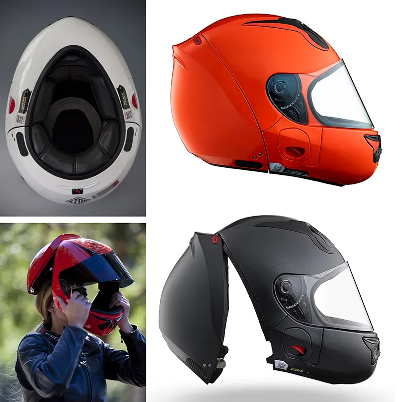
TERM
Interactive Experiences
Interactive experience design creates digital or physical experiences that people use and respond to. Designers plan screens, controls, feedback and information so an interaction feels clear and useful.
Careers: UX designer, UI designer, web designer, app designer and game designer.
TRY THIS!
Choose an app, website or game you use often. Find out who made it, then describe one goal the designers may have had and one part of the experience they needed to make easy to use.

VIDEO
THE FOUR DESIGN FIELDS
 Stakeholders
 Design Critique
 Design Pitch
WORKPLACE INTERACTIONS
Stakeholders
Stakeholders are people or groups who have an interest in a design project or may be affected by it. They help the designer understand needs, priorities and limitations.
Types of Stakeholders
Clients, users, team members and people affected by the outcome may all contribute useful viewpoints.
EXAMPLE
Jim is designing the landscaping for a local park. He consults local residents and council staff to understand what the community wants, the available budget and the project's rules and limitations.
Design Critique
A design critique is a review of work in progress. Designers and stakeholders discuss what works, what needs improvement and how the design could better meet the brief.
Items that can be Critiqued
Visual appeal, functionality, user experience, technical quality, communication and the usefulness of new ideas.
EXAMPLE
Jim shares two park-sign designs with his team and local residents. Their feedback shows that the map is difficult to read from a distance, so he increases the contrast, enlarges the labels and asks the group to review the updated design.
Design Pitch
A design pitch explains a proposed solution and why it meets the brief. The designer presents the idea clearly and supports decisions with evidence.
Design Pitches can include
Research findings, concepts or prototypes, an explanation of benefits for users, a timeline, a budget and relevant sources of inspiration.
EXAMPLE
Jim presents his final landscaping idea to the council. He explains the community research, shows a concept plan and model, outlines the materials and cost, and explains how the design creates a safe, welcoming place for local families.
Automatic
 Copyright
Registration
 Patent
 Trade mark
COPYRIGHT & INTELLECTUAL PROPERTY
COPYRIGHT & INTELLECTUAL PROPERTY
Automatic
Registration
INTRODUCTION
Respecting creative work
Intellectual property, or IP, refers to creations that the law can protect, including creative works, inventions and brand identifiers. Different types of IP have different forms of protection.
In Australia, copyright protection arises automatically for eligible work. Patents, registered designs and registered trade marks involve application processes. When using someone else’s images, fonts or other work, check the permission or licence and follow its conditions. Giving credit does not by itself grant permission. Keep records of your sources and permissions as you develop your own designs.
Automatic
Copyright
Protects original creative work.
Copyright protects original work such as drawings, photos and writing, rather than the idea behind it. In Australia, protection is usually automatic once the work is recorded.

LOOK CLOSER
Your original drawing can be protected without an application. Someone wanting to copy it may need permission, unless a licence or legal exception allows the use.

Registration
Patent
Protects how an invention works.
A patent can protect a new and inventive product or process. It must be applied for and granted; having an idea does not automatically give you a patent.
LOOK CLOSER
The Apple drawings show an invention described in patent material. An application does not prove that a patent was granted or that the product will be made.

Registration
Trade Mark
Helps people recognise a brand.
A trade mark identifies a business's goods or services. It can be a name, logo or distinctive shape. Registration gives legal protection for the goods or services it covers.
LOOK CLOSER
The Coca-Cola bottle shows how a distinctive shape can help people recognise a brand, even without reading its name.

VIDEO
INTELLECTUAL PROPERTY
Design field specialists
 Messages
 Environments
 Objects
 Interactive Experiences
General
 Subject Matter Expert
SPECIALISTS
SPECIALISTS
Design field specialists
General
INTRODUCTION
Working with specialists
Specialists bring detailed knowledge or skills to a design project. A designer may work with a photographer, illustrator, engineer, developer or fabricator to solve a particular problem.
Choose expertise that suits the project. Explain the brief, agree on responsibilities and share feedback as the work develops. For example, a lighting specialist could help an interior designer test how a shop will feel and function, while a fabricator could advise how a proposed object can be made.
Design field specialists
Environment Design Specialists
To help the function, safety and aesthetics of designed environments.
Specialists include engineers, builders, landscape architects, lighting designers, accessibility consultants and sustainability consultants. They help with safety, construction, circulation, materials, lighting and spatial atmosphere.
PRO TIP
Look for features that help people use the space comfortably. Consider the lighting, flooring and furniture, then explain which specialist could help each feature suit children in a busy library.

Design field specialists
Object Design Specialists
To help products function safely, efficiently and attractively.
Specialists include product and mechanical engineers, manufacturers, material specialists, ergonomists, model makers and 3D-print technicians. They help with testing, safety, usability, production, form, finishes and materials.
PRO TIP
Start with what the product needs to do. Consider blending performance, durability, cleaning and safety, then connect each need to a specialist's expertise.

Design field specialists
Message Design Specialists
To help the function or aesthetics of communication using messages.
Specialists in message design can include accessibility experts, printers, print-production specialists, typographers, copywriters, illustrators, photographers, colour consultants and signwriters. They assist function through readability, access, print technology and hierarchy, and aesthetics through imagery, illustration, typography, colour and visual style.
PRO TIP
Look closely at the cover images and the physical books. Identify which parts may need photography, illustration or print expertise, and explain how that contribution helps the book communicate.

Design field specialists
Interactive Experiences Specialists
To help digital experiences work clearly, accessibly and engagingly.
Specialists include UX researchers, UI designers, developers, accessibility specialists, content designers, data specialists and cybersecurity experts. They help with user testing, navigation, accessibility, privacy, interaction and visual consistency.
PRO TIP
Consider how someone will use this interface in a vehicle. Look at readability, controls and the information shown, then explain how specialist input could reduce confusion and support appropriate use.

General
Subject Matter Experts
To provide expert knowledge about the problem, users or context.
Subject matter experts have deep knowledge of a topic, industry, community or user group. They help designers understand accurate content, needs, risks and context so the design is appropriate and credible.
PRO TIP
Ask what knowledge the designer needs beyond design skills. Use the museum's purpose and its older and newer structures as clues, and explain how expert advice could inform the decisions.

VIDEO
SPECIALISTS

Worked example: Specialists
Discuss how the designer may have worked with a specialist during the deliver stage of the design process. (4 Marks)
Identify a specialist Name a relevant specialist and explain how they could help during Deliver.
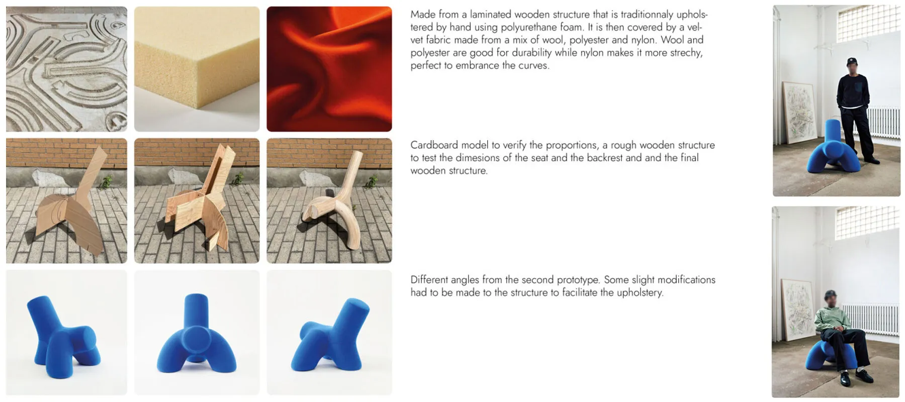
During Deliver, the designer could work with a computer-controlled cutting technician, often called a CNC technician. They could arrange the curved plywood parts within standard sheets, helping reduce waste and checking that each part can be cut accurately.
Explain their contribution Link their possible advice to the fit, construction and appearance of the design.
Accurate cutting could help the chair's parts line up during assembly and create a smooth base for the upholstery. The designer and technician could check the fit together, linking the specialist's advice to the chair's construction and appearance.
Name the Deliver stage and a specialist who could help prepare the design for production.
Explain how arranging parts on a sheet could reduce waste and support accurate cutting.
Connect the advice to the finished design. Use words such as could when you do not know who actually worked on it.

 Contexts
 Visual LanguageStakeholders
 Evaluating Ideas
 Factors
 Legal and Ethical
ANALYSING DESIGN PRACTICE
Context
How a designer's working environment shapes their practice
A designer's working context includes their workplace, tools, budget and deadlines. Some work alone; others work in teams. These conditions affect the methods they choose, the people they work with and the projects they can take on.
EXAMPLE
A freelance illustrator works from a home studio and speaks directly with clients. A designer at a branding agency works with photographers and writers. Their workplaces change how they share ideas and organise projects.
Visual Language
How designers develop a distinctive visual style
Visual language is the way a designer uses elements, principles, images and conventions. Some favour simple shapes and clear layouts; others use expressive marks and detailed images. These choices give their work a recognisable style that suits particular audiences.
EXAMPLE
One designer uses simple shapes and a small colour palette for business logos. Another uses loose lines and textured images for posters. Their different visual styles help communicate different messages and attract different clients.
Stakeholders and Specialists
Who designers work with and how they collaborate
Designers work with people who bring different needs and skills. Clients, users and community members share feedback, while specialists offer expert advice. Looking at these relationships helps you understand whose needs guide the design and how decisions are made.
EXAMPLE
A playground designer works with engineers and local families to plan useful play equipment. A festival designer works with organisers and artists to create an event identity. Each team brings knowledge suited to the project.
Evaluating Ideas
How different designers test and improve their work
Designers evaluate ideas by checking how well they meet the brief. They might test models, take measurements or ask users for feedback. The method depends on the question: does the design work safely, communicate clearly or create the intended feeling?
EXAMPLE
A helmet designer tests models for fit and impact resistance. A campaign designer asks an audience how they understand a poster. Both check their ideas, but they need different evidence to judge whether the design works.
Factors
Which influences designers consider most important
Social, cultural, environmental, economic and technological factors affect design decisions. A project's purpose and audience help determine which factors need most attention. Compare specific features to explain each designer's priorities, rather than assuming all designers value the same things.
EXAMPLE
A designer working with an Aboriginal community follows that community's guidance about cultural content. An appliance designer considers production costs and available technology. Both respond to several factors, but each project has different priorities.
Legal and Ethical
How designers respond to rules and responsibilities
Designers must follow relevant laws and consider how their choices affect others. This may involve permission to use images, cultural knowledge, safety, accessibility or privacy. The project determines which issues matter, so explain the responsibility and how the designer responds.
EXAMPLE
A designer creating packaging for an Indigenous-owned business checks permissions and cultural guidance. A designer making a children's app considers privacy and accessibility. Both need to understand the responsibilities linked to their project.
VIDEO
ANALYSING DESIGN PRACTICE
Worked example: Analysing Design Practice
Using a specific design example from two contemporary designers you have studied this year, compare how the selected designers have responded to factors that influence design. (8 marks)
Introduce your comparison Name both designers, their projects and the factors you will discuss.
This comparison considers Ingels' LEGO House and Spalter's work on Instagram. One is a physical place; the other is a digital experience. Technological and social factors help explain their different choices about how people interact.
Compare technology Explain how the tools support different kinds of design work.
Technology gives each designer different tools. Digital modelling can help plan a complex building, while interface design tools help organise screens and controls. The tools support different outcomes, but both help designers develop and test ideas.
Compare social factors Compare visible features that help people interact.
LEGO House provides spaces where people can meet and play in person. Instagram provides screens for sharing visual posts. Comparing these features shows how each design responds to a different setting for social interaction.
Explain the difference Link the different choices to the setting and needs of users.
Both examples support connections between people, but in different ways. A building needs to organise physical movement and shared spaces; an app needs clear controls and information. The design choices respond to those different user needs.
Say what each designer creates and where their work is used.
Clearly state the social, cultural, environmental, economic or technological factor you are discussing.
Describe a specific choice the designer made in a named project.
Link the choice back to the factor, audience and purpose.
Manual
 Drawing
 Painting
 Photography
 3D Model making
 Screenprinting
 Etching
Digital
Digital Drawing Digital CollageDigital 3D Modelling
VIDEO
METHODS
METHODS
METHODS
Manual
Digital
INTRODUCTION
METHODS
Methods are the processes designers carry out to explore ideas, develop concepts and produce design solutions. They may be manual, such as painting or model making, or digital, such as digital drawing or 3D modelling.
Manual
Drawing
Drawing is the method of making marks to communicate ideas, record observations or develop design concepts. It can range from quick, expressive sketches to precise technical drawings and realistic representations.
PRO TIP
Choose a drawing approach that suits the task: loose sketches help explore ideas quickly, while measured drawings explain how something should be made.

Manual
Painting
Painting is the method of applying pigment to a surface using tools such as brushes, rollers or palette knives. Designers can use it to explore colour, express ideas, develop imagery and create different visual styles.
LOOK CLOSER
Compare the energetic splashes with the soft landscape. Paint handling changes the mood, so designers can choose an approach that suits the audience's aesthetic preferences.

Manual
Photography
Photography is the method of capturing images using a camera. Designers can select subjects, lighting, viewpoint and composition to document people and places, present products or produce abstract imagery.
PRO TIP
Plan the framing, background and lighting around what the audience needs to notice. A clear product view serves a different purpose from an atmospheric landscape.

Manual
Model Making/Prototyping
Model making is the method of constructing a physical representation of a proposed design. Models and prototypes help designers explore form, scale, spatial relationships, construction and, where appropriate, function.
PRO TIP
Decide what you need to test before making a model: scale, movement, layout or assembly. Use affordable materials and only add the detail needed to answer that question.

Manual
Screenprinting
Screenprinting is a method of transferring ink through a prepared mesh screen onto a surface. It can produce bold graphics, repeatable images and layered colours on materials such as paper and fabric.
LOOK CLOSER
Notice how a limited set of inks can produce detailed portraits, bold graphics and overlapping colours. The print's visual richness does not depend on using many different inks.

Manual
Etching
Etching is a printmaking method in which a design is incised into a plate, traditionally using an etchant to create recessed lines. Ink held in those lines is transferred to paper to produce detailed prints.
LOOK CLOSER
Compare the direction and density of the fine lines. They suggest skin, fur, architecture and atmosphere. The examples show the appearance of etched prints; the plate-making process is not visible.

Manual
Collage
Collage is the method of selecting, arranging and attaching separate materials or image fragments to make a new composition. It can combine paper, photographs, printed matter and textured materials.
PRO TIP
Choose fragments for their colour, texture and meaning. Try different arrangements before fixing them down, and consider whether torn or cut edges best suit the intended mood.

Digital
Digital Drawing
Digital drawing is the method of creating drawings using software and input tools such as a stylus or graphics tablet. Digital brushes, shapes, colour and layers allow designers to produce both precise illustrations and expressive images.
PRO TIP
Choose brushes and line styles to match the intended result. Keep major parts on separate layers so you can change colour, detail or placement without redrawing everything.

Digital
Digital Collage
Digital collage is the method of combining and editing separate digital images to create a new composition. Designers can use selection tools, masks, layers and adjustments to blend photographs and graphics in realistic or imaginative ways.
LOOK CLOSER
These images combine subjects that would not normally appear together. Changes in scale, masking and layered textures create a surreal mood that may suit an imaginative audience or message.

Digital
Digital 3D Modelling
Digital 3D modelling is the method of constructing three-dimensional forms in computer software. Designers can model environments, products and three-dimensional lettering, then adjust their shape, materials, lighting and viewpoint.
LOOK CLOSER
Compare the environmental space, object concept, solid lettering and translucent product rendering. Each uses the same broad method for a different purpose: exploring a place, refining an object, creating a graphic or testing the appearance of materials and light.

Digital
3D Printing
3D printing is the method of producing physical objects from digital models by building up material layer by layer. Designers use it to test the shape and fit of prototypes, make scale models and produce finished objects.
PRO TIP
Test a small version first. Consider size, moving clearances, print time and layer direction, because a shape that looks good on screen may need adjustment to print and work properly.


Worked example: Methods
Discuss how two methods have been used effectively in this message design. (6 Marks)
State the two methods and their purpose: State the two methods and their purpose: Introduce the methods (e.g. embroidery and collage) and how they support communication.
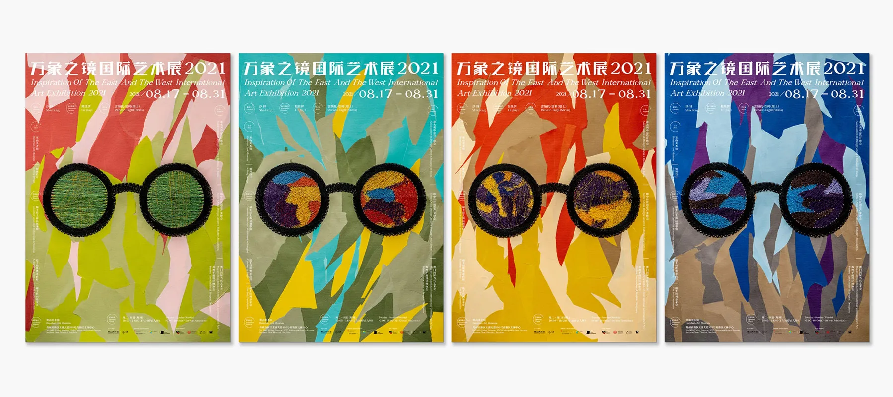
This poster series uses the methods of collage and embroidery to create a unique and tactile visual language that celebrates creative diversity and craft. Both techniques work together to engage viewers and reflect the cultural themes of the exhibition.
Describe the collage technique and visual effect: Describe the collage technique and visual effect: Link the method to its aesthetic and communicative purpose.
The hand-cut collage method forms layered, abstract backdrops using torn paper shapes in different colour palettes. This playful layering reflects artistic freedom and helps distinguish each poster while still feeling cohesive as a set.
Describe the embroidery method and its effect: Describe the embroidery method and its effect: Explain how it adds to the visual communication or tactile experience.
Embroidery is used to frame and fill the lens areas of the illustrated glasses. The thread texture adds dimension, making the posters feel handcrafted and personal, aligning with the message of cultural vision and connection.
Function in context: Function in context: Discuss how both methods support the goal of the message design.
These handmade techniques communicate the exhibition's theme — "Inspiration of the East and the West" — by combining traditional craft with contemporary design, attracting attention and inviting viewers to explore the diversity of artistic expression.
Methods are doing words — like collage, painting, digital drawing or embroidery. Choose two used in the design and explain how each one was applied.
Use design vocabulary to describe what each method looks like in the design and how it adds to the message, meaning, or engagement.
Explain how the combined use of these methods enhances the communication goals of the design — such as grabbing attention, expressing theme, or reflecting a handmade or cultural identity.
Physical
 Paper & Card
 Glass
Glass Metal
Metal Plastic
 Masonry
 Concrete
 Rubber
 Timber
Digital
 Screens
VIDEO
MATERIALS
MATERIALS
MATERIALS
Physical
Digital
INTRODUCTION
MATERIALS
Materials are the surfaces or substrates on or from which designs are made. Examples can include but are not limited to paper, card, textile, metal, plastic, glass, touchscreen or digital interface.
Physical
Paper & Card
Paper and card are sheet materials used for printed messages, packaging and model making. Their thickness, stiffness, texture and finish influence how a design looks, folds, holds its shape and feels to the user.
PRO TIP
Start with purpose and context: will the design fold, carry weight or be handled often? Compare paper samples for stiffness, surface texture and printing quality before choosing a stock.

Physical
Glass
Glass is a hard material that can be transparent, translucent, coloured or reflective. It is used in architecture, signage and objects to admit light, create visual connections and communicate a clean, precise aesthetic.
LOOK CLOSER
Glass can reflect its surroundings or allow views through a space. Compare the building, partition, sign and drinking glass to see how thickness and transparency change its role.

Physical
Metal
Metal is a material used in objects, signage and buildings because it can provide strength, durability and precise finishes. Different metals and surface treatments can produce reflective, brushed, matt or textured aesthetic qualities.
PRO TIP
Select a metal and finish for the job: consider exposure, cleaning, weight and wear as well as appearance. Brushed and polished finishes can give the same form very different visual qualities.

Physical
Plastic
Plastic refers to a family of materials that can be formed into flexible films, rigid objects and transparent or coloured surfaces. Designers select different plastics for their weight, durability, flexibility, finish and intended use.
LOOK CLOSER
Compare flexible, frosted, coloured and clear examples. Plastics have different properties, so identify the type and intended use before assuming how durable, reusable or recyclable a product will be.

Physical
Masonry
Masonry is built from individual units, such as bricks, stones or blocks, laid together to create walls, paving and other structures. The size, colour, texture and arrangement of the units influence an environment's character.
PRO TIP
Consider location, weather, maintenance and use when choosing masonry. Unit size and surface texture affect both the visual pattern and how people experience a wall or paved area.

Physical
Concrete
Concrete is a material made from cement, water and aggregates, commonly used for floors, walls, stairs and structural elements. Formwork and surface finishing can produce smooth, textured or patterned appearances.
LOOK CLOSER
The finish changes the character of concrete: smooth panels feel restrained, exposed stones feel coarse, and timber impressions add texture. The formwork and finishing process influence these results.

Physical
Rubber
Rubber is a flexible, resilient material used where grip, cushioning, sealing or impact resistance is needed. Its surface may be smooth or patterned, and its formulation determines how soft, elastic or durable it is.
LOOK CLOSER
Bentu Design's Wu stools are made from recycled shoe rubber. Coloured rubber fragments create the distinctive speckled surfaces, giving discarded material a new use as furniture. Look at how the colours, texture and sculptural form turn a practical recycled material into a strong visual feature.
Explore the project on Dezeen
Learn more

Physical
Timber
Timber is a natural material used for furniture, buildings and interior finishes. Its grain, colour, strength and ability to be worked into different forms can contribute warmth and character to a design.
LOOK CLOSER
Timber remains a widely used material in buildings and furniture. Compare the curved chair, courtyard, structural panels and rocking chair: grain, shape and finish can create warmth and character while serving very different functions.

Digital
Digital Screens
A screen is the display surface on which digital visual communication appears. Screens can present changing imagery, light, colour, type and interactive controls across devices of different sizes and viewing contexts.
PRO TIP
Design for the screen's context. Consider viewing distance, orientation, lighting and interaction: a phone, public kiosk and roadside display need different text sizes and amounts of information.


Worked example: Materials
Explain how one material has been used effectively in this design. (4 Marks)
Name the material + link to its function: Name the material + link to its function: Clearly state the material and describe how it supports the product's use or purpose.
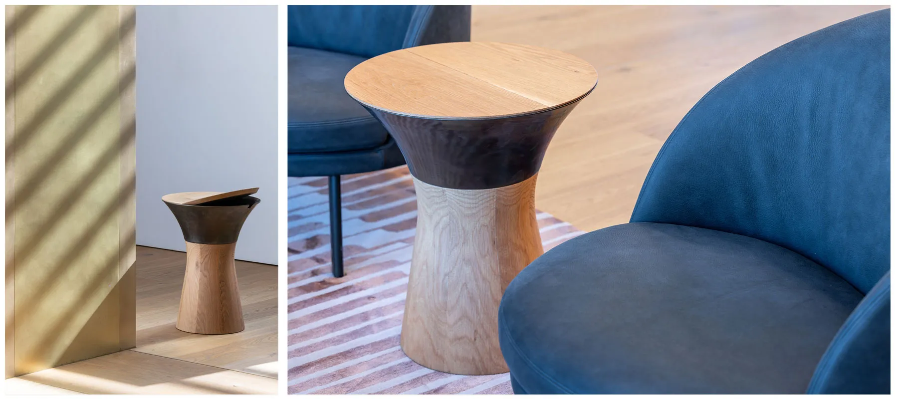
Timber has been used effectively in the base of this table design to provide a strong, stable, and visually warm foundation. Its natural grain and tone contribute to the object's inviting and premium appearance.
Support your statement with visible features: Support your statement with visible features: Identify what we can observe about how the material is used or treated.
The smooth curves of the timber form a solid base that contrasts with the upper section, and the material's finish showcases its grain while still feeling clean and refined — suitable for both practical and decorative use.
Name one material used and describe what it offers — think strength, durability, aesthetics, or sustainability.
How does the material help the product work better or look better? Consider structure, comfort, texture, or user interaction.
Manual
PaintInk or GraphiteDigital
 Vector Based media
 Raster Based media
VIDEO
MEDIA
MEDIA
MEDIA
Manual
Digital
INTRODUCTION
MEDIA
Media are the tools and applications you use to communicate ideas visually. Manual media include pencil, ink and paint. Digital media include software for drawing, editing photos, modelling and animation. Each offers different ways to create marks, colours and images.
Manual
Watercolour, Acrylic, Gouache (Paint based medias)
Paints create different marks and surface effects. Acrylic dries quickly, while oils dry slowly enough for extended blending. Gouache usually gives solid, matt colour. Watercolour uses transparent layers that let the paper show through, creating lighter, softer effects.
TRY THIS!
Look at illustrations in several children's books. Find out which paints the illustrators used, then compare the effects: are the images bold and brash, or soft and calming? Point to colour, texture and brush marks as evidence, and explain how the style might appeal to the intended readers.

Manual
Ink, Pencil, Pastel (Drawing based medias)
Ink, pencil and pastels create different drawing effects. Ink makes strong lines and dark areas. Pencil allows fine lines, soft shading and changes with an eraser. Pastels make soft, blendable marks that help build colour, texture and tone.
PRO TIP
Test the marks a medium can make before choosing it. Pencil suits editable sketches; ink suits decisive lines and strong contrast. Choose marks that communicate the intended mood and detail.

Digital
Raster-based Media
Raster images are made from tiny squares called pixels. They suit photographs, detailed textures and smooth colour changes. You can edit individual areas in software, but enlarging a small image too far can make its pixels visible and its edges unclear.
LOOK CLOSER
Raster images can hold subtle tones, textures and photographic detail. Their pixel dimensions limit how far they can be enlarged, so plan the output size before creating detailed work.

Digital
Vector-based Media
Vector graphics use paths and shapes that software can resize without blurring their edges. They suit logos, diagrams and illustrations that need clear outlines. You can use the same artwork on a small card or a large sign.
PRO TIP
Use vector artwork when clean shapes must work at many sizes, such as a logo used on both a card and a sign. Keep the editable vector original; a JPEG export no longer has that scalability.


Worked example: Media
Explain how one medium has been used effectively in this design. (4 Marks)
Identify the media + describe its effect: Identify the media + describe its effect: Clearly name the media and explain what it achieves visually or functionally.
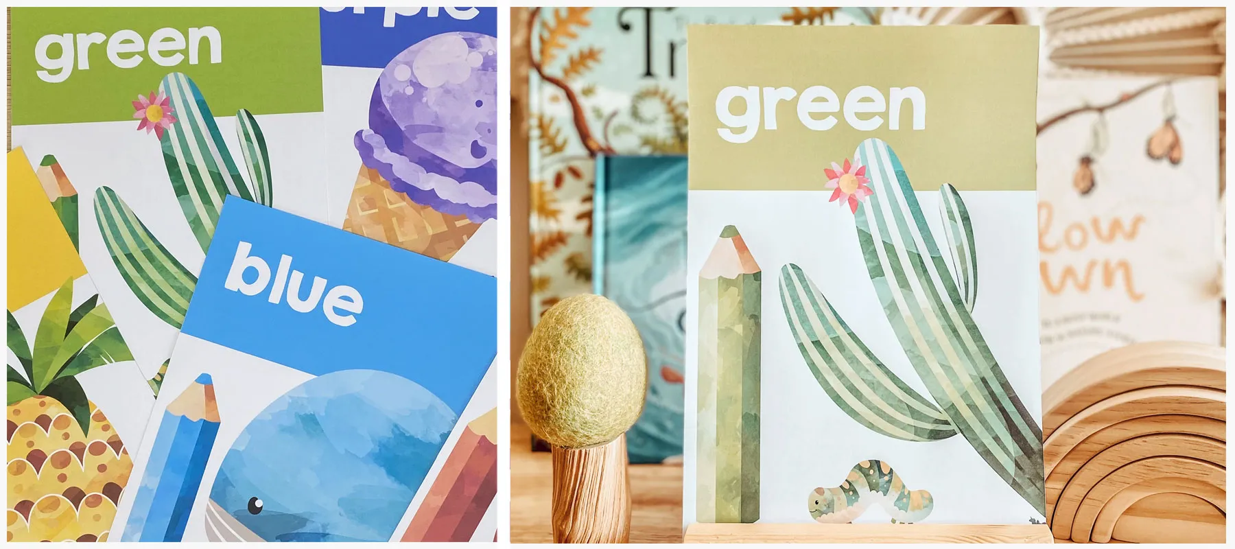
This design uses digital raster-based media to create soft, painterly illustrations that feel handmade and child-friendly. The gradients and blending effects give the images depth and warmth.
Describe what we can observe about the media: Describe what we can observe about the media: Reflect on texture, line, colour, and layering as evidence of the media used.
The soft edges, layered tones and subtle transparency in the whale, cactus, and pencil shapes are all features of digital painting software, making the posters feel playful and calm — ideal for an educational setting.
Media are what the design is created with — e.g. raster-based software, vector tools, watercolour, markers, etc. Don't confuse it with materials or methods.
Describe how the media affects the final look — e.g. colour richness, softness, vibrancy, texture or layering. Connect this to the audience or purpose of the design.
Paraline
 Isometric
 Planometric
Perspective
 One Point
 Two Point
Object
 Third Angle Orthogonal
 Packaging Net
Environment
 Elevations
 Floorplans
DRAWING SYSTEMS
DRAWING SYSTEMS
Paraline
Perspective
Object
Environment
INTRODUCTION
DRAWING SYSTEMS
Drawing systems help you show a design's shape, size and depth. Each system follows different rules and reveals different information. Choose a system that suits your purpose, then keep its lines, angles and views consistent throughout the drawing.
Paraline
Isometric
Isometric drawings show an object's height, width and depth in one view. Vertical edges stay vertical, while edges running in the other two main directions slope at 30° to the baseline. Parallel edges stay parallel instead of meeting in the distance. Designers use isometric drawings to explain products, rooms, assembly steps and complex systems clearly.
TRY THIS!
Draw an isometric storage box using vertical lines and 30° angles. Add a lid, a handle and a circular opening drawn as an ellipse. Keep matching edges parallel.

Paraline
Planometric
Planometric drawings build a 3D view up from a floorplan. The plan is rotated, and vertical lines are added to show height. The two plan directions are usually drawn at 45° and 45°, or 30° and 60°. Designers use this system to show room layouts, furniture arrangements and how different levels of a building fit together.
TRY THIS!
Draw a simple bedroom plan, then rotate it so its main edges sit at 45° to the baseline. Add vertical lines to give the walls and furniture height. Leave out the nearest walls so the room is easy to see.

Perspective
One Point Perspective
One-point perspective shows depth using one vanishing point on a horizon line at the viewer's eye level. Edges that run directly away from the viewer aim towards this point. Front-facing horizontal and vertical edges stay horizontal and vertical. Designers use it to show interiors, corridors and views looking straight down a street.
TRY THIS!
Draw a horizon line and mark one vanishing point. Draw a rectangle for the back wall of a room, then extend lines through its corners towards the edges of the page. Add a desk and windows, using the same vanishing point for their receding edges.

Perspective
Two Point Perspective
Two-point perspective shows an object or building from a corner, so you can see two sides. Each set of receding horizontal edges aims towards its own vanishing point on the horizon. Vertical edges stay vertical. Designers use it to present buildings, furniture and products with a convincing sense of depth.
TRY THIS!
Place two vanishing points far apart on a horizon line. Draw a vertical line between them for the nearest corner of a small shop. Connect its top and bottom to both points, then add side walls, a door and windows.

Object
Third Angle Orthogonal
Third angle orthogonal drawings describe an object using separate, flat views rather than a single 3D picture. The top view sits above the front view, and the right-side view sits to its right. Aligned views, dimensions and standard line types help designers and makers communicate an object's shape and size accurately.
TRY THIS!
Choose a simple object such as a pencil holder. Draw its FRONT VIEW, TOP VIEW and RIGHT SIDE VIEW in the correct positions. Use light projection lines to align matching features, then add a few dimensions and any hidden edges.

Object
Packaging Net
A packaging net shows a box or package opened out flat. It includes the panels, flaps and tabs needed to make the 3D form. Different lines show where to cut and fold. Packaging designers use nets to plan assembly, fit the product inside and position text and graphics on the correct panels.
TRY THIS!
Sketch what this net will look like when folded. Then draw a small box net on scrap card, including dust flaps and a glue flap. Mark cut and fold lines differently, cut it out safely and test whether it closes.

Environment
Floorplans
A floorplan shows a room or building from above, as though it has been sliced horizontally and the upper part removed. It shows walls, doors, windows and the arrangement of spaces. Designers use floorplans to plan furniture, movement and room sizes. Dimensions and section markers connect the plan to other drawings.
TRY THIS!
Draw a simple floorplan of your classroom using a scale such as 1 cm for 1 m. Include doors, windows and key furniture. Add two dimensions, then mark a section line A through the room to show where an imaginary vertical cut would go.

Environment
Elevations
An elevation shows a building's outside or an internal wall straight on, without perspective. A section imagines cutting through the building to reveal the inside. The examples here are sections: they show room heights and how the roof, floors and interior spaces fit together.
TRY THIS!
Use your classroom floorplan to draw a straight-on elevation of one wall. Include the door, windows and furniture at a consistent scale. Then draw a simple section through the room to show the floor, ceiling and internal height.

Message and Interactive Experience Design
 LayoutsTypographic
 Grids
Grids Wireframes
Object and Environment Design
 Symbols
 Dimensions2-Dimensional
 3-Dimensional
COMMON CONVENTIONS USED BY DESIGNERS
COMMON CONVENTIONS USED BY DESIGNERS
Message and Interactive Experience Design
Object and Environment Design
COMMON DESIGN RULES
COMMON CONVENTIONS USED BY DESIGNERS
Design conventions are shared rules that help people understand a design. They guide how you arrange text and images, use symbols and record measurements. Choose conventions suited to your design field so your work communicates clearly.
Message and Interactive Experience Design
Layouts
Layout conventions organise text and images through spacing, scale, alignment and grouping. Consistent margins create clear edges; related content sits together; and differences in size and emphasis establish a reading order. These choices help viewers understand what matters first.
PRO TIP
Set a main focal point, then arrange supporting information in a clear order. Align related edges, keep spacing consistent and place captions close to their images. Check that the layout still makes sense when viewed quickly or reduced in size.

Message and Interactive Experience Design
Typographic
Typographic conventions govern how letters and text are arranged. Use consistent heading levels, suitable text alignment and readable line lengths. Kerning adjusts pairs of letters, tracking changes spacing across a group, and leading controls the distance between baselines. These choices should support clear reading.
PRO TIP
Choose a small set of type styles and use each for a consistent purpose. Check body text at its actual size, give lines enough breathing room and avoid stretching letterforms. Use the hotspots to distinguish letter anatomy from spacing controls.

Message and Interactive Experience Design
Grids
A grid sets out margins, columns, gutters and alignment guides. Text and images line up with this underlying structure, creating consistency across pages or screens. A grid supports variation while keeping related information organised.
PRO TIP
Choose columns that suit the format and content. Keep gutters and margins consistent, align related elements and allow important images to span columns when needed. Check that text is not squeezed into lines that are too narrow.

Message and Interactive Experience Design
Wireframes
Wireframe conventions describe structure and function before visual styling. Simple boxes stand for images or content areas, labels identify controls, and repeated navigation stays in a consistent position. The emphasis is on hierarchy, task flow and relationships between screens.
PRO TIP
Use simple shapes and clear labels rather than polished decoration. Show the main task, navigation and important controls, then test whether a user can explain what to do next. Keep repeated controls consistent across screens.

Object and Environment Design
Symbols
Drawing symbols follow shared conventions so readers can identify features such as doors, windows and fixtures. Keep their shapes and line treatment consistent, use the correct view and scale where relevant, and include a key for unfamiliar symbols.
PRO TIP
Use a reference key rather than inventing a new symbol for a familiar feature. Check that door swings and fixture positions make sense in the plan, and do not use one symbol to represent different things without explanation.

Object and Environment Design
Dimensions
Dimensioning conventions communicate actual sizes, regardless of the drawing scale. Use clear numerical values, thin dimension and extension lines, and consistent end marks appropriate to the drawing type. Place smaller dimensions nearer the drawing and overall dimensions farther out.
PRO TIP
Keep numbers easy to read and avoid crowding them against the object. Check that shorter measurements agree with the overall size. Use one consistent unit convention and avoid repeating the same measurement unnecessarily.

Object and Environment Design
2-Dimensional
Two-dimensional drawing conventions organise flat views so a design can be read accurately. In third angle orthogonal drawing, the top view sits above the front view and the right-side view sits to its right. Align matching features, use a consistent scale and distinguish visible edges from hidden details.
PRO TIP
Label each view clearly and check matching widths and heights between views. Use light guides for alignment, then apply the correct line types and dimensions. A floorplan or elevation follows the conventions of its own drawing type rather than a perspective view.

Object and Environment Design
3-Dimensional
Three-dimensional drawing conventions control how depth is represented. In isometric and planometric drawings, corresponding parallel edges stay parallel. In perspective, receding edges converge towards vanishing points. Consistent axes, angles and proportions make the form understandable.
PRO TIP
Choose the drawing system that suits the information you need to show. Keep to that system throughout the drawing: check axes in parallel projections and vanishing points in perspective. Avoid mixing incompatible directions just to make a part fit.

VIDEO
CONVENTIONS OF DESIGN FIELDS

Worked example: Conventions Of Design Fields
Identify two conventions the designer has used to communicate effectively within this design. (4 Marks)
Opening sentence (Name both conventions): Opening sentence (Name both conventions): Clearly identifies the two conventions and signals that the response will explain how they support communication.
The designer has used the conventions of typography and layout to communicate the energetic “Mission Possible” message clearly and effectively.
Describe typographic features + effect: Describe typographic features + effect: Point to specific type choices (case, colour, weight, spacing) and explain how they help communication.
The designer follows typographic conventions by using bold, uppercase sans serif lettering with strong colour contrast on a black background. Each motivational verb appears on its own line with a full stop, creating emphasis and rhythm so the audience can quickly read and remember the key actions.
Describe layout/grid features + effect: Describe layout/grid features + effect: Explain how alignment, grouping and grid structure organise information and guide the viewer’s eye.
Left-aligned text and even spacing create a clear reading path. On the right, a grid groups photographs, colour blocks and the logo. This arrangement connects the slogan with the people shown and keeps the message organised.
Link back to effective communication: Link back to effective communication: Conclude by stating how both conventions work together to engage the target audience.
Together, these typographic and layout conventions make the message bold, legible and well-structured, helping the inspirational slogan connect with its intended audience.
Choose conventions that clearly appear in the design, such as typography, layout, grid, or imagery. Make sure you can link them to specific features.
Refer to observable details: typeface, case, colour, alignment, spacing, columns or modules. Use accurate design vocabulary rather than vague descriptions.
For each convention, state how it helps the viewer understand the message. Think about readability, hierarchy, emphasis and how it appeals to the target audience.
environmental conventionsorthogonal conventionsTECHNICAL DRAWING CONVENTIONS
environmental conventions
Environmental drawings use shared conventions for plans, elevations, dimensions, symbols and line types so others can interpret the design consistently.

orthogonal conventions
Third-angle orthogonal drawings align views of an object and use consistent line types, dimensions and symbols to communicate its form and construction.

 Sketch Out
 Crating
 DetailsFinishing
2D to 3D Drawing
2D to 3D Drawing
FROM ORTHOGONAL VIEWS TO A CONVINCING 3D FORM
2D to 3D Drawing
A small toy house demonstrates how a plan, front elevation and side elevation can guide a convincing three-dimensional drawing.
Work in stages: sketch the overall form, build it using simple boxes, add details and check the result. Keep early guide lines light so you can change them. Strengthen the final edges once you have checked the shapes and positions.
TERM
Sketching Out
Spend a minute or two sketching how you think the toy house will look in 3D. Choose a viewpoint and place the walls, roof and chimney. Check their relative sizes before starting a more accurate drawing, so you can spot problems early.

TERM
Crating
Draw light boxes, called crates, around the house, roof and chimney. Match their sizes to the supplied views. Cross each face diagonally to find its centre, then use these guides to position features accurately instead of guessing where the centre appears.

TERM
Details
Once the main boxes look right, add the door, window, chimney and roof thickness. Use the centre lines and supplied views to position each feature. Darken the final edges while keeping your construction lines light, so the finished form remains clear.

TERM
Finishing
Compare your drawing with the original plan and elevations. Check thicknesses, joins and small details you may have missed. Correct the shapes and positions first, then strengthen important outlines and lighten extra guide marks so the house is easy to read.

 DevelopmentDocumentation
 Presentation
TYPES OF DRAWINGS
Development
Development drawings explore and refine ideas. They are often loose sketches that test variations, with line, three-dimensionality and shading used to explain a concept rather than provide final production details.
EXAMPLE
Jim produces a series of developmental sketches for his design project. He explores variations in his ideas, using loose lines, three-dimensional views and shading to communicate each concept. The sketches help him compare possibilities and decide what to develop further.
Documentation
Documentation drawings record precise measurements, geometry and other technical information. They use clear drawing conventions to communicate a resolved design to people involved in approval or production.
EXAMPLE
Jim produces a series of technical drawings that document specific measurements and geometry. He provides them to a builder, council or fabricator so the design can be assessed and accurately produced.
Presentation
Presentation drawings are high-quality illustrative depictions of finished design solutions, often called artists’ impressions. They communicate the proposed appearance using manual or digital drawing, rendering or modelling methods.
EXAMPLE
Jim creates a polished artist’s impression of his finished design solution. Using manual or digital drawing or modelling, he shows its form, materials, colour and lighting so the client can clearly imagine the proposed outcome.
ClientClient Need AudiencePurpose
 Context
 Design Criteria
 Deliverables
THE BRIEF
Client
Who is asking for the design?
The client is the person or group asking for the project. They explain what they need, answer questions and give feedback. They may not be the person who uses the finished design.
EXAMPLE
The school's sustainability team asks you to create clearer bin signs. They explain the current problem, approve the final designs and arrange for the signs to be printed.
Client Need
What problem needs solving?
The client need explains what is not working and what needs to change. Research helps you understand the real problem before deciding what to make.
EXAMPLE
Food scraps keep ending up in recycling bins because the labels are confusing. The team needs signs that help people choose correctly without stopping to read long instructions.
Audience
Who will use or see it?
Describe the people the design needs to reach. Find out about their knowledge, routines and access needs instead of assuming everyone wants the same thing.
EXAMPLE
The signs need to help people choosing a bin during busy breaks. Some users are still learning English, so the team plans to test clear images and simple words.
Purpose
What should it achieve?
Purpose is the result you want, such as informing, guiding or helping someone complete a task. It explains why the design is needed rather than what it should look like.
EXAMPLE
The purpose is to help people put rubbish in the correct bin. The signs should make the choice clear quickly, rather than simply making the bins look attractive.
Context
Where and when will it be used?
Context is the situation in which people encounter a design. Think about location, lighting, weather, viewing distance and the time people have.
EXAMPLE
The signs will be used in busy corridors and outdoors, where they may get wet. The team checks viewing distance, lighting and weather when choosing materials and text sizes.
Design Criteria
How will you judge success?
Design criteria are requirements you use to compare and test ideas. Link them to the problem and users. Include practical limits such as budget, size or available materials.
EXAMPLE
The signs must fit the existing bins, survive rain and be readable from two metres away. These requirements give the team clear ways to test each proposed design.
Deliverables
What will you hand over?
Deliverables are the finished things the client expects. Agree on their format, number and deadline so everyone knows what is included.
EXAMPLE
The client expects three matching, print-ready signs for recycling, food waste and general waste. The team agrees on the file format, final size and deadline before beginning production.
 Discover
 Define
 Develop
 Deliver
DESIGN PROCESS
DESIGN PROCESS
EXPLORE, FOCUS, DEVELOP AND REFINE
DESIGN PROCESS
The Double Diamond helps designers understand a problem, define a clear brief, explore ideas and deliver a well-resolved solution.
The process can guide message, object, environment and interactive experience design. Divergent thinking opens up possibilities; convergent thinking helps select and refine them. Designers often return to earlier stages as research, testing and feedback reveal new information.
TERM
Discover
During Discover, designers explore the problem before choosing a solution. They observe people, interview stakeholders, investigate existing designs and collect inspiration. Research might focus on a product, message, space or digital experience. Record a wide range of findings so decisions are based on evidence rather than assumptions.
WORKED EXAMPLE
These folio pages show mind mapping, observations and visual research. The same approach can help investigate any design problem: understand people and context, explore existing solutions and gather varied inspiration before settling on an idea.

TERM
Define
During Define, designers compare their research and decide which needs matter most. They identify the audience, purpose, context and communication needs, along with limits such as time, budget, materials and technology. These findings become a design brief that explains what the solution must achieve without deciding exactly how it will look.
WORKED EXAMPLE
These pages bring together audience research, context and a brief. In any field, use this stage to turn research into clear priorities and requirements that will guide and help evaluate your ideas.
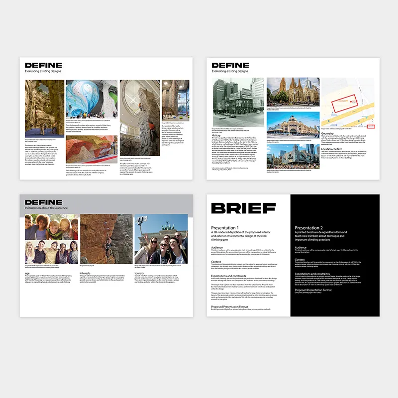
TERM
Develop
During Develop, designers generate and test a range of ideas in response to the brief. Sketches, layouts, models, storyboards and digital prototypes help explore alternatives. Designers experiment with visual language, materials and interactions, then use feedback to compare, combine and improve promising concepts.
WORKED EXAMPLE
The sketches and annotations show several alternatives being explored. Use methods suited to your project, such as layout sketches, product models or interface wireframes, to make ideas visible and compare how they answer the brief.
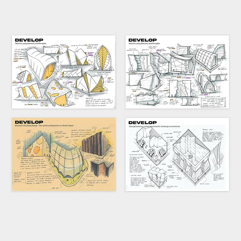
TERM
Deliver
During Deliver, designers select and refine a concept, test important details and prepare the final presentation or production files. They use feedback and the brief to check that the solution works for its audience and purpose. The outcome might be a printed design, product, space or interactive experience. Document decisions and evaluate how well the result meets the brief.
WORKED EXAMPLE
These pages show evaluation, refinement, production records and a final presentation. Apply the same steps to your project: act on feedback, resolve details, record important decisions and present evidence that the solution meets the brief.

 Divergent ThinkingConvergent Thinking
THINKING TYPES
Divergent Thinking
Divergent thinking opens up possibilities. Be curious and imaginative, explore different perspectives and hold off judging ideas too soon. The aim is to discover several ways a problem could be solved.
Mind Mapping
Write a central idea on a page, then add branches for related thoughts, questions and possibilities. Make connections between branches to discover new directions.
Brainstorming Session
Share and record as many ideas as possible, either alone or with a group. Build on suggestions and save judging them for later so unusual ideas have a chance to develop.
SCAMPER Technique
Change an existing idea using these prompts: Substitute, Combine, Adapt, Modify, Put to other uses, Eliminate and Reverse. For example, ask what you could combine or remove to create a different solution.
Role Play
Imagine or act out how someone might use a design. Explore different situations to generate ideas for their needs. Check these ideas with real users rather than assuming role play tells you everything.
Random Stimuli
Choose an unrelated word, image or object and connect it to your design problem. A leaf, for example, might suggest a folding structure, a branching layout or a new texture.
Convergent Thinking
Convergent thinking narrows the options. Compare ideas, look at evidence and reflect on what will work best. Use the brief, research and feedback to choose a direction and improve it.
Evaluating and Ranking Ideas
Agree on what matters, such as usefulness, cost and ease of use. Compare ideas against these criteria and rank them. Explain your choices with evidence instead of choosing only your favourite.
SWOT Analysis
Identify Strengths, Weaknesses, Opportunities and Threats. Consider what works well, what needs improvement, what could help the idea succeed and what could cause problems.
Decision Matrix
Create a table with ideas in rows and design criteria in columns. Score each idea against the criteria. Give more important criteria greater weight, and discuss the reasons behind the scores.
Comparative Analysis
Compare design options side by side using the same questions. Identify the strengths and weaknesses of each to decide which features best meet the brief.
PMI (Plus, Minus, Interesting)
List the positives, negatives and interesting possibilities of an idea. Use the comparison to decide what to keep, change or investigate before moving forward.
VIDEO
THINKING TYPES
 Design Ideas
 Design Concepts
 Design SolutionsPrototypes
FORMS OF DESIGNING
Design Ideas
Design ideas are early possibilities for solving a problem. They can be broad and unfinished, shown through quick notes or sketches. You explore several ideas before choosing which ones deserve more development, rather than settling on your first thought.

Design Concepts
Design concepts are ideas developed into clearer proposals. Sketches, layouts or models show how each proposal might work. You add enough detail to compare options and get feedback, while keeping room to change the design as you learn more.

Design Solutions
A design solution is the developed response to the brief. It brings together choices about appearance, function and production. You use drawings, models or files to explain the result and check that it meets the agreed needs and requirements.

Prototypes
A prototype is a trial version used to test part of a design. It can be physical or digital, simple or detailed. You might test size, movement or controls, then use what you learn to improve the next version.
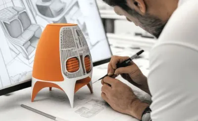
VIDEO
FORMS OF DESIGNING
 Social
 Cultural
 Environment
 Technology
 Economic
FACTORS
FACTORS
INTRODUCTION
FACTORS
Design decisions respond to people, culture, the environment, technology and budgets. These factors influence how a design looks, how it works and how it is made. Explore each example and connect a visible feature to the need or constraint it may address.
TERM
Social
Social factors are the needs, lifestyles and expectations of people in a community. Designers consider differences in age, ability, literacy and how people use a design. These choices can influence both appearance and function. The posters show how clearer text, accessible controls and different ways to receive information can help more people use a service.
TRY THIS!
Redesign a school event poster or sign-up form for a wider range of users. Make three changes, such as clearer headings, larger controls or simpler wording. Explain who each change could help.
Learn more about accessibility in design
Learn more

TERM
Cultural
Cultural factors include the traditions, beliefs, languages and shared meanings of a community. They can influence colours, patterns, materials and how a design is used. Designers should learn from the people whose culture is represented and respect their knowledge and choices. Cultural expression is more than decoration: it can communicate identity, belonging and connections to place.
TRY THIS!
Choose a design connected to your own family or community. Identify a colour, material, pattern or custom that gives it meaning. Sketch a design that responds to this connection and explain who you would consult before sharing it.

TERM
Environment
Environmental factors concern how a design uses resources and affects the natural world. Designers consider material choices, waste, energy use, transport and what happens when a product is no longer needed. Refillable containers and reusable products can reduce repeated packaging use. Their overall impact still depends on how they are made, used, cleaned and eventually disposed of.
TRY THIS!
Choose a product you regularly throw away. Sketch a reusable or refillable alternative. Explain how it could reduce waste and identify one challenge, such as cleaning, transport or replacing worn parts.

TERM
Technology
Technology influences what designers can create and how they make it. Digital modelling, 3D printing and interactive software can open up new forms and experiences. Designers also work within limits, such as available equipment, skills, production time and cost. The examples show complex forms, layered construction and digital information added to a view of the real world.
TRY THIS!
Sketch a useful object with a shape that would be difficult to cut from one flat sheet. Explain how 3D modelling and printing might help make it. Then identify one limitation you would need to test, such as strength or printing time.

TERM
Economic
Economic factors involve the money available to design, make, buy and maintain something. Designers balance cost, quality and appearance. Bold prices may suggest savings, while more space and carefully arranged photographs may suggest luxury. Appearance alone does not prove quality or price.
TRY THIS!
Cover the price in an advertisement and study the design. Does it suggest luxury or savings? Identify three clues, such as colour, type or photography. Uncover the price and compare it with your prediction.

VIDEO
FACTORS


Worked example: Factors
Identify and discuss two factors which may have influenced this design solution. (6 Marks)
Identify a social factor Name the social need and connect it to visible features.
Social factors may influence how these chairs support people gathering together. Their separate seats can be arranged for different group sizes, while varied colours can make a shared space feel welcoming.
Support your point Explain what the features suggest and what you would need to test.
The open sides give people room to move, but this does not prove the chairs suit everyone. Some users need armrests for support. A designer would need user feedback to check comfort and access.
Explain an economic factor Connect construction or storage choices to possible costs without assuming exact savings.
Economic factors include production, storage and maintenance costs. A simple frame may reduce the number of parts needed, while stacking can save space. These features suggest possible savings, but actual costs depend on materials and production.
Choose factors you can connect to visible features. Explain what the picture suggests and what you would need to investigate.
Name each factor and explain how it could affect a design choice, such as arranging chairs for group conversation.
Describe the feature, then connect it to a possible benefit. Do not assume exact materials, costs or accessibility from appearance alone.
 Purpose
 AudienceContext
FRAMING GOOD DESIGN
Purpose
Purpose is the job a design needs to do. It might inform, guide, persuade or help someone complete a task. Knowing the purpose helps you decide which information and features are essential.
EXAMPLE
The school’s open-day signs need to guide visitors to classrooms and activity areas. Clear destination names and arrows matter more than decorative detail because the main task is helping people find their way.
Context
Context is the situation in which a design is made and used. Consider location, viewing distance, lighting, time available, technology and social expectations. These conditions influence how the design needs to work.
EXAMPLE
Outdoor signs may be seen in bright light, from a distance and among crowds. The designer uses strong contrast and weather-suitable materials, places signs at decision points and checks their visibility during a busy event.
Audience
The audience is the group of people a design needs to reach or serve. Research their knowledge, language, routines and access needs. Do not assume that everyone in a group has the same abilities or preferences.
EXAMPLE
The visitors include new students, families and people unfamiliar with the campus. The designer tests simple wording, recognisable symbols and readable type with several visitors, including people with access needs.

Worked example: Framing Good Design
Discuss how the context of the design example influenced design decisions. (4 Marks)
Opening sentence with your main point: Opening sentence with your main point: Clearly state the context and explain its direct influence on the overall design approach.
Limited space in a busy urban setting influences this housing design. Stacking the units uses height rather than spreading across more land. Inside, furniture that combines sleeping and storage functions helps make a small room useful.
Evidence with design language: Evidence with design language: Link specific features (e.g., stacked vertical neighbourhoods, compact integrated furniture) to the small-footprint constraint.
These choices respond to the site's limited area and the daily needs of residents. The stacked arrangement creates more living space, while combined furniture leaves room for movement. The design still needs careful checks for comfort and access.
Identify the environment or situation (e.g., dense urban setting) and explain how it shapes the designer’s overall approach.
Identify two clear design decisions made in response to the context — focus on visible, justifiable features.
Describe the decisions using accurate terms — e.g., “vertical stacking of modular units” or “multi-functional integrated furniture modules.”
 Interviews
 Surveys
 Focus Groups
 Competitor AnalysisAudience/User Personas
 Ethnographic research
HUMAN CENTRED DESIGN RESEARCH
Interviews
Interviews are conversations that help you understand people's experiences and needs. Ask open questions, listen carefully and follow up on unclear answers. A useful interview explores what someone actually did and why, rather than only asking what they like.
EXAMPLE
A designer interviews passengers about the last time they bought or topped up a ticket. One explains that a failed payment left them unsure whether they had been charged. Follow-up questions help the team plan clearer payment messages for the new system.
Surveys
Surveys ask several people the same questions so you can compare their answers. You might count common responses or collect short written comments. Use clear, neutral questions and include a suitable range of people, not just those easiest to reach.
EXAMPLE
The team surveys passengers about how often they travel, how they pay and which ticketing tasks they find difficult. They offer both paper and online versions so people without smartphones can take part. The answers help identify common problems to investigate.
Focus Groups
Focus groups bring a small group together to discuss a topic or design. You can hear different views and ask follow-up questions. Give everyone time to speak, because one confident person should not decide what the whole group thinks.
EXAMPLE
A small group of commuters, occasional travellers and visitors discusses early ticket-machine screens. The facilitator gives everyone a chance to speak. Confusion about fare names suggests the team should test simpler labels before finalising the system.
Audience Personas
A user persona is a fictional profile based on patterns in your research. It describes relevant needs, goals and habits. Use it to keep real findings in mind while designing, rather than inventing a stereotype or assuming everyone is alike.
EXAMPLE
Using patterns from interviews and observations, the team creates a fictional passenger profile: Alex, an occasional traveller who needs clear fare information and prefers paying without a phone. The profile keeps these researched needs in mind without assuming every occasional traveller is the same.
Ethnographic Research
Ethnographic research studies people in their everyday settings. You observe activities, listen and ask questions to understand their routines and needs. With permission, record what happens and the surrounding conditions, then look for problems your design could help solve.
EXAMPLE
With participants' permission, a researcher accompanies passengers as they buy tickets and board public transport. They notice that people carrying bags struggle to find their ticket while approaching the reader. This suggests the team should test easier ways to present and scan tickets.
Competitor Analysis
Competitor analysis compares existing products or services to see what they offer and where they fall short. You can learn from their features, but this is not always human-centred research. Check your ideas with users to understand their actual needs.
EXAMPLE
The team compares ticketing systems from other transport networks, looking at payment options, top-up steps and help messages. This reveals possible approaches, but comparing features alone cannot show what local passengers need. The team checks the ideas through passenger research.
Worked example: Human Centred Design Research
Identify and discuss two human centred design (HCD) research methods used in the discover stage of the design process for an Interactive Experience Designer. (6 Marks)
Name your first method Explain how interviews help you understand users during Discover.
Interviews help a designer understand passengers during Discover. Open questions about recent journeys reveal needs and problems. For a new ticketing system, the designer could ask what happened the last time a passenger bought a ticket.
Give an example Connect a passenger response to a possible design improvement.
A passenger describes a failed payment that left them unsure whether they were charged. Follow-up questions help the designer understand the confusion and plan clearer payment messages. This connects the research to a specific design choice.
Name your second method Explain what you can learn by observing people in context.
Contextual observation means watching people use something in its everyday setting. With permission, the designer could observe passengers buying and scanning tickets. This can reveal practical difficulties that people forget to mention in an interview.
Give an example Link an observed difficulty to something you could change and test.
For example, a passenger carrying bags struggles to reach a ticket reader. The designer records the steps and tests a clearer, easier-to-reach control arrangement. Observation helps connect the design to the conditions in which people use it.
Choose research methods that are clearly suited to the discover stage, such as user interviews, contextual observation, focus groups, or surveys.
Each opening sentence should name the method and explain its purpose — why the designer chose it and what kind of information it provides.
Use a specific example, such as a passenger struggling to find a payment message. Explain how your research could guide a design change. Make clear when an example is imagined.
DemographyInterests Habits
 Experiences
 Mindset
AUDIENCE ANALYSIS
Demography
Who do you want to reach?
Demography describes characteristics of a group, such as age, location and language. Use details that matter to the project, but do not assume these tell you everything about a person.
EXAMPLE
A library finds that families speak several languages. It tests pictures and translated labels to help visitors find sections.
Interests
What catches their attention?
Interests are the activities and topics people enjoy or care about. Learning about them helps you choose relevant images and messages. Ask people rather than relying on stereotypes.
EXAMPLE
A school club surveys students and finds an interest in wildlife. Its poster shows habitat projects members can join.
Habits
What do they regularly do?
Habits are repeated actions and routines. Notice when and where people use information, how much time they have and what devices they use. Design around these real situations.
EXAMPLE
Students check the canteen menu while lining up, so meal names and prices need to be quick to read.
Experiences
What do they already know or remember?
Past experiences affect how people understand a design. Some users recognise a symbol or task, while others need an explanation. Find out what is familiar and where people have struggled.
EXAMPLE
New students have not used the school's room codes before, so a map explains them beside the building names.
Mindset
What do they think, feel and value?
Mindset includes people's attitudes, beliefs and motivations. It affects whether they trust a message or want to act on it. Listen to their concerns and respond respectfully.
EXAMPLE
Students say repairing clothes seems difficult. A workshop poster explains that beginners are welcome and shows a simple first task.
VIDEO
AUDIENCE ANALYSIS
 Shared Mind MapsPeer CritiqueStakeholder SurveyDesign Pitch
COLLABORATION TECHNIQUES
Shared Mind Maps
Connect everyone's ideas.
Write the problem in the centre of a page. Invite everyone to add branches with questions, observations and possible causes. Group related ideas and decide what you still need to find out.
EXAMPLE
Students and teachers map why visitors get lost at school. They notice hidden entrances, confusing room names and missing directions.
Peer Critique
Give helpful, specific feedback.
Ask classmates to review your work. Explain your goal, then invite them to identify strengths and suggest improvements. Discuss the design rather than criticising the person, and record useful feedback.
EXAMPLE
A classmate notices the proposed signs use different names from the timetable. The team agrees to use matching names.
Stakeholder Survey
Ask people affected by the design.
A stakeholder is someone involved in or affected by a project. A survey asks people the same questions so you can compare answers. Use clear wording that does not push people towards a preferred answer.
EXAMPLE
The team asks new students which places were hardest to find and asks office staff where visitors most often need help.
Design Pitch
Explain your direction and invite questions.
A pitch is a short presentation explaining a problem and your proposed response. Use sketches or examples to make your idea clear. Listen to questions and use the feedback to improve your next steps.
EXAMPLE
The team presents a map and sign ideas. New students suggest including familiar landmarks, such as the library entrance.
Indigenous ledSelf-determinedCommunity specificDeep listeningImpact of designIndigenous knowledgeShared knowledgeLegal and moralReconciliation Action Plan (RAP)Charter implementationTHE INDIGENOUS DESIGN CHARTER
THE INDIGENOUS DESIGN CHARTER
AUSTRALIAN INDIGENOUS DESIGN CHARTER
Designing with respect for Indigenous cultures
The Charter has ten connected principles for respectfully representing Aboriginal and Torres Strait Islander cultures. Indigenous people should guide how their own cultures and knowledge are shared.
Use these principles together from the start of a project. Build relationships, listen, ask the right people for permission, and agree on payment and credit. The Charter is a guide to good practice, not a law or a set of patterns to copy. The worked examples explain how designers could apply it; the images do not prove that these steps took place.
TERM
Indigenous led
Aboriginal and Torres Strait Islander people from the relevant community should lead designs about their cultures. Involve them from the start, pay them fairly and share credit and benefits.
WORKED EXAMPLE
For a public mural like this one, invite local Indigenous artists and community representatives to lead the project. They help decide which stories can be shown and how. Agree on payment and credit. The picture alone cannot tell us whether these steps happened.
Learn more about the Australian Indigenous Design Charter
Learn more

TERM
Self-determined
Indigenous communities have the right to decide how their cultures are shown. The appropriate people can give permission, ask for changes, set limits or say no. Designers must respect these decisions.
WORKED EXAMPLE
For a school uniform like the one pictured, involve Indigenous students, artists and the relevant community before choosing artwork. Ask the people with cultural authority what can be used and where. Agree on credit, and get permission before changing the design.
Learn more about the Australian Indigenous Design Charter
Learn more

TERM
Community specific
Aboriginal and Torres Strait Islander communities have different cultures, languages and rules for sharing knowledge. Ask the relevant local people how to work respectfully. Permission from one community does not cover another.
WORKED EXAMPLE
For signs like these, work with the Traditional Owners of that place. They guide which names, language, images and stories can be shared. Agree on the final wording and rules for copying or photographing it. Do not assume the same content can be used elsewhere.
Learn more about the Australian Indigenous Design Charter
Learn more

TERM
Deep listening
Listen patiently and respectfully before making design choices. Use clear language, allow time for decisions and be willing to change your ideas. Give people room to speak, pause and ask questions.
WORKED EXAMPLE
For drink labels like these, listen to the artists and relevant community members before choosing stories, colours or patterns. Explain your ideas clearly and allow time for feedback. Change the design when needed. The finished labels alone cannot show how well the team listened.
Learn more about the Australian Indigenous Design Charter
Learn more

TERM
Impact of design
Think about how a design affects the people and cultures it represents. A place can help people gather, share knowledge and feel that their culture is recognised. Work with the relevant Indigenous community to decide what can be shared, and avoid stereotypes or exposing private knowledge.
WORKED EXAMPLE
Ngarara Place at RMIT was designed by Jefa Greenaway's practice with an Indigenous team. Its seating, garden and artwork draw on the Kulin Nations' seven seasons. The space supports gathering, ceremonies and learning, showing how design can strengthen cultural recognition and connection.
Explore Ngarara Place at RMIT
Learn more

TERM
Indigenous knowledge
Local Indigenous knowledge can help shape a design, especially one connected to a place. Ask Traditional Owners whether and how it should be included. Finding a story online does not give you permission to use it.
WORKED EXAMPLE
For a pathway and garden like this, ask Traditional Owners whether local knowledge could guide the plants, paths, names or signs. If they choose to take part, they decide what can be shared. Use their guidance with permission, rather than adding cultural patterns just as decoration.
Learn more about the Australian Indigenous Design Charter
Learn more

TERM
Shared knowledge
Work together with the appropriate Indigenous people from the beginning. Agree on decisions, payment, credit and who owns the work. The people sharing knowledge decide what others may use or make public.
WORKED EXAMPLE
A project about a place could start with community-led meetings and walks on Country. Pay people for their time and knowledge. Develop the design together, agree on what can be shared and ask them to review it. Record how credit and benefits will be shared.
Learn more about the Australian Indigenous Design Charter
Learn more

TERM
Legal and moral
Respect artists’ rights and the community’s rules for cultural knowledge. Ask permission for the exact use you plan, give credit and agree on payment. Owning an artwork does not mean you may copy or change it.
WORKED EXAMPLE
Buying an artwork from a gallery does not automatically let you put it on a website or T-shirt. Ask the artist and relevant cultural knowledge holders for written permission. Agree on payment and credit, and check before cropping, changing colours or sharing the file.
Learn more about the Australian Indigenous Design Charter
Learn more

TERM
Reconciliation Action Plan (RAP)
A Reconciliation Action Plan sets out practical steps for an organisation to build respectful relationships with Aboriginal and Torres Strait Islander peoples. It should name who will act, provide time and money, and check progress.
WORKED EXAMPLE
For a campus like this, a RAP could include working with Traditional Owners early, paying Indigenous designers and buying from local Indigenous businesses. Name the staff responsible, set a budget and check progress. Adding artwork at the end is not enough on its own.
Learn more about the Australian Indigenous Design Charter
Learn more

TERM
Charter implementation
Put the Charter into practice throughout a project, from the first idea to the finished design. Record permissions, protect private knowledge and ask the appropriate people to review the work before it is shared.
WORKED EXAMPLE
A design studio could plan paid community meetings, record permissions and arrange cultural checks before publishing. If permission is unclear, pause and ask. When handing over the design, explain any limits on copying or changing it so the next person follows the same rules.
Learn more about the Australian Indigenous Design Charter
Learn more
