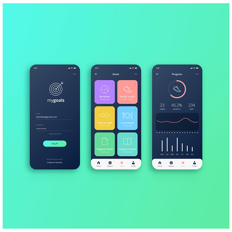
DESIGN ELEMENTS
aesthetic decisions made by designers, using the design elements and principles
DESIGN ELEMENTS
This introduction outlines the core concepts and terminology explored across the tabs.
Use this introduction to understand how the topic fits within visual communication design practice before exploring each term in detail. As you move through the tabs, focus on what each concept means, how it can be identified in a design, and why a designer may use it. Connect visible evidence to audience, purpose, context and communication needs, then use precise terminology to explain and evaluate the effectiveness of the design decisions.
Point
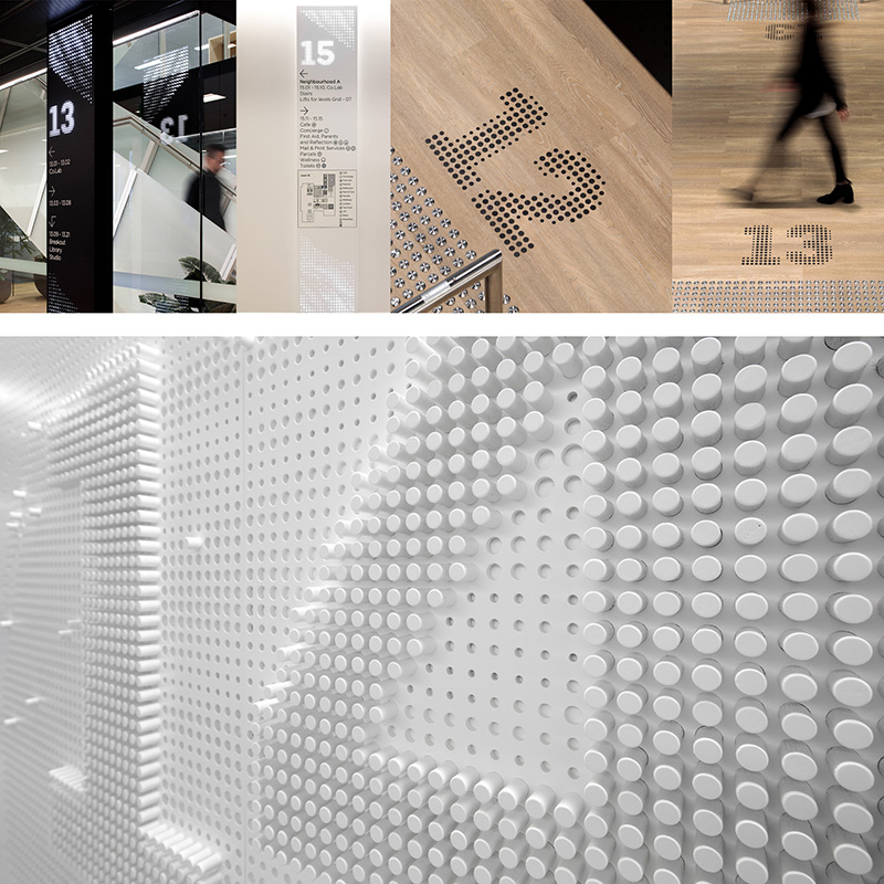
Point is the smallest visual element: a single mark that establishes a precise location. Designers can vary its size, colour, tone, spacing and density to attract attention, organise information or suggest movement. Repeated points may build lines, patterns, symbols or tonal fields. As an aesthetic decision, point can create emphasis, rhythm and hierarchy while guiding where an audience looks first and how they move through a communication.

WORKED EXAMPLE
In the wayfinding system, repeated circular points form arrows, numerals and directional markers. Their changing scale and density turn simple marks into recognisable instructions, while the bright points contrast with surrounding surfaces. This deliberate use of point creates hierarchy and guides visitors clearly, demonstrating an aesthetic decision that supports both visual identity and navigation.
Line
Line is a continuous mark connecting points or defining a path. It may be straight, curved, thick, thin, solid, broken or implied. Designers use line to divide space, outline forms, connect information and direct the viewer’s eye. Its direction and character can communicate stability, energy, softness or movement. Deliberate line choices help establish hierarchy, rhythm and structure while contributing to the overall aesthetic character of a design.
WORKED EXAMPLE
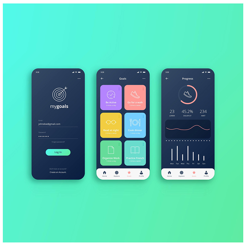
Across the MyGoals interface, fine outlines define icons and controls, while graph lines connect changing data over time. Vertical bars and the circular progress line direct attention to performance information. These consistent line weights create a clean, organised aesthetic and demonstrate how line can clarify hierarchy, connect content and make a digital design easier to navigate.
Shape
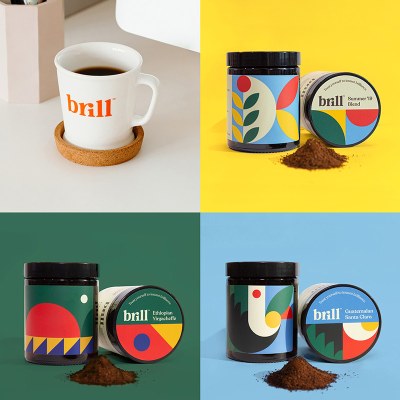
Shape is a flat, enclosed two-dimensional area created by an outline, colour, tone or surrounding negative space. Shapes may be geometric, organic, abstract or symbolic. Designers combine and repeat them to construct imagery, communicate meaning, organise layouts and establish a visual identity. Choices about shape can influence mood and recognition, while scale, placement and interaction between shapes contribute to balance, contrast, pattern and hierarchy within a composition.
WORKED EXAMPLE
The Brill coffee identity combines circles, semicircles and leaf-like organic shapes across packaging and cups. Repeating these bold forms creates a playful visual system, while overlapping geometric areas distinguish flavours and surfaces. The designer’s aesthetic decision to use simple, recognisable shapes builds pattern and cohesion, making the brand distinctive across several applications without relying on complex imagery.
Form
Form describes an object’s three-dimensional volume, mass and physical presence. It may be geometric or organic and is understood through height, width, depth, contour and the way light creates highlights and shadows. Designers shape form to address function, ergonomics, materials and context, while also producing an aesthetic response. Form can communicate solidity, movement, protection or openness and influence how users approach, occupy or handle a designed object or space.
WORKED EXAMPLE
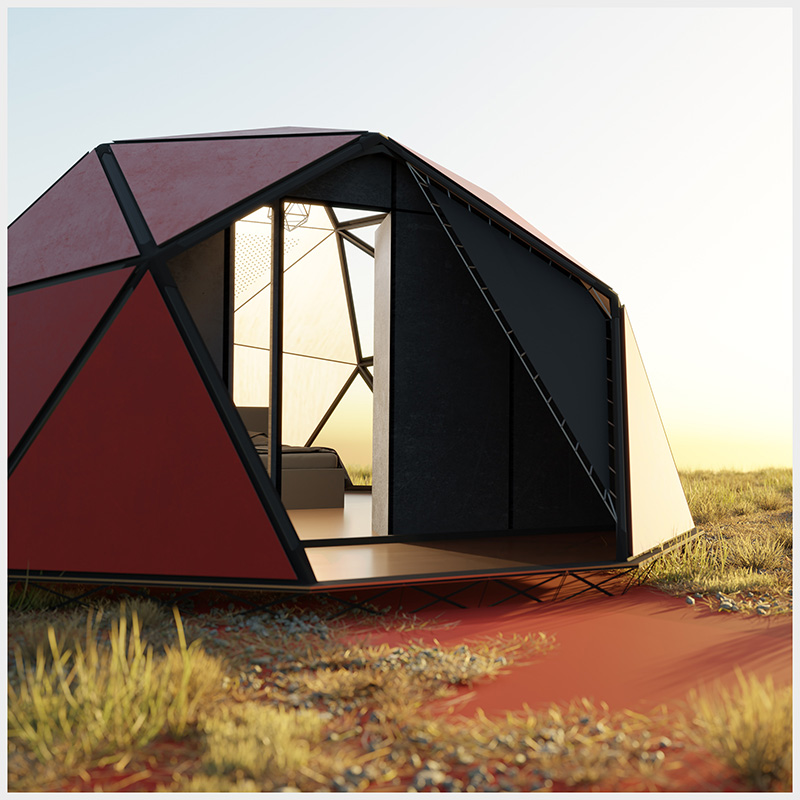
The compact shelter uses a faceted, dome-like form constructed from angular panels. Its low volume appears protective in the exposed landscape, while the projecting entrance creates access and visual direction. Contrasting red surfaces and dark structural edges clarify each plane. The form is therefore an aesthetic decision that communicates portability, strength and function through an immediately legible three-dimensional silhouette.
Tone
Tone is the relative lightness or darkness of a colour or surface. Designers use tonal variation to create contrast, depth, volume, atmosphere and visual hierarchy. Gradual shifts can suggest curvature or softness, while sharp differences can separate information and improve legibility. Tonal decisions also influence mood: darker values may feel dramatic or refined, whereas lighter values can appear open or delicate. Effective tone helps viewers distinguish figure, ground and focal information.
WORKED EXAMPLE
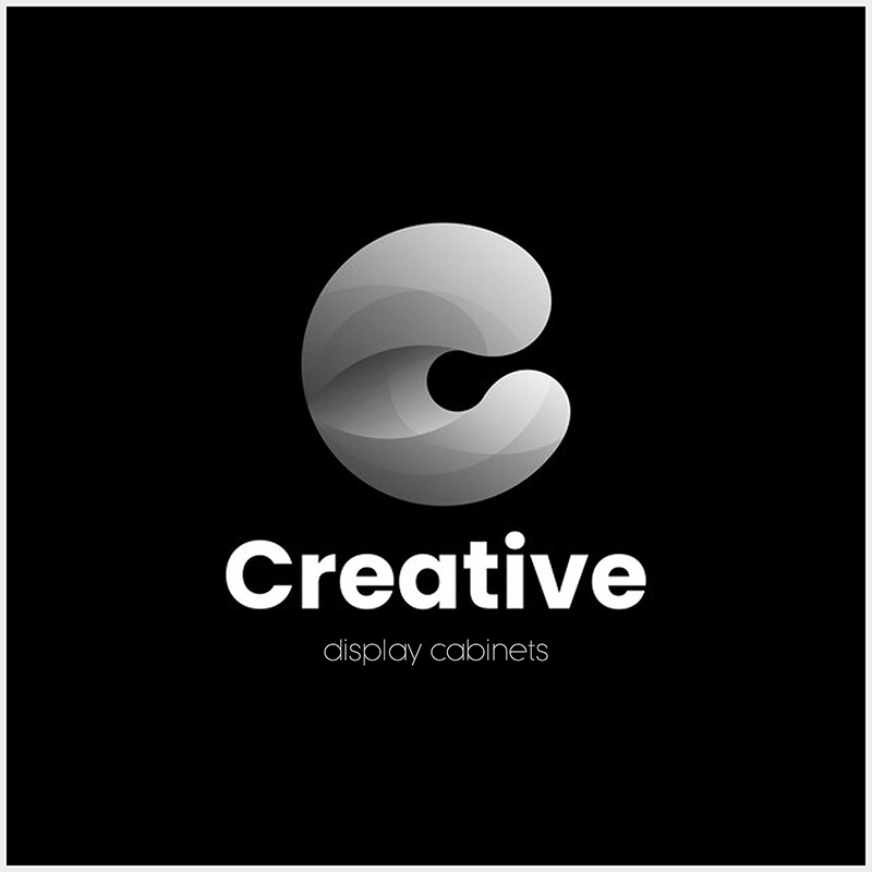
The Creative Display Cabinets identity places a layered grey-to-white symbol against a deep black ground. Gradual tonal changes make the curved mark appear translucent and dimensional, while the white lettering remains highly legible. This controlled contrast creates a sophisticated focal point and shows how an aesthetic decision about tone can establish depth, hierarchy and a refined brand character.
Texture
Texture is the actual or implied surface quality of a material, such as rough, smooth, glossy, soft or coarse. Actual texture can be touched, while visual texture is represented through imagery, pattern, line, tone or colour. Designers use texture to communicate material properties, create sensory interest and distinguish surfaces. Texture choices can also reinforce context and function, influence perceived quality and introduce contrast or unity within an aesthetic composition.
WORKED EXAMPLE
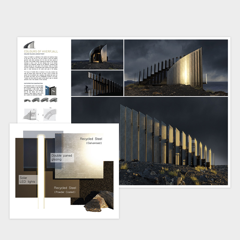
The Hverfjall lookout contrasts rough volcanic rock with smooth recycled steel, reflective glazing and glowing light strips. Close material samples and atmospheric renders make these tactile differences visible. The restrained textures connect the structure to its rugged site while distinguishing constructed surfaces, demonstrating an aesthetic decision that communicates material durability, environmental context and a deliberate sensory experience.
Type
Type is the visual form of written language. Its typeface, size, weight, case, spacing, alignment and arrangement affect meaning, tone, identity and readability. Designers use typographic contrast to establish hierarchy and guide reading order, while consistent treatment creates unity across applications. Expressive type can communicate attitude or emotion, whereas restrained type may prioritise clarity. Every typographic choice is both a functional and aesthetic decision shaped by audience, purpose and context.
WORKED EXAMPLE
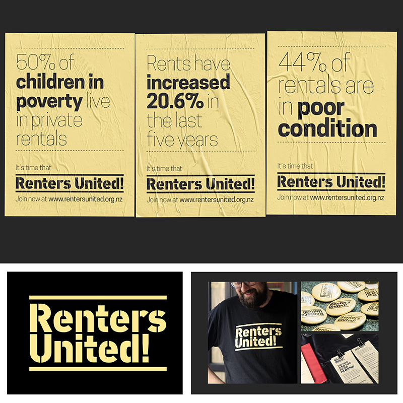
The Renters United campaign contrasts bold, condensed display lettering with lighter statistical text. Oversized slogans demand attention, while smaller supporting copy provides evidence and detail. Consistent black and yellow treatments unite the posters. This typographic hierarchy turns complex housing messages into direct advocacy, demonstrating an aesthetic decision that supports urgency, readability and a confident collective voice.
Colour
Colour is perceived through hue, saturation and value. Designers select and combine colours to create mood, symbolism, identity, contrast and hierarchy. Warm or saturated colours may attract attention, while cooler or muted palettes can feel calm or restrained. Colour relationships can unify elements, distinguish categories and support navigation, but cultural associations and accessibility must also be considered. Purposeful colour decisions shape how an audience interprets and emotionally responds to a design.
WORKED EXAMPLE
The MyGoals interface uses a dark navy base with coral, purple, yellow, green and blue accents. Bright colours separate activity cards, controls and progress information, while the consistent palette unifies both screens. Coral highlights the current status and primary actions. This aesthetic use of colour creates an energetic mood, clarifies hierarchy and makes fitness data easier to scan.